Reviving a college art supply store on a budget.
It wouldn't be an art college without an art supply store nearby. As CCAD's one-stop-shop, Ampersand Emporium caters to all the needs of the student body, and is instrumental in drawing prospective students as well as alumni. Oh, and there's plenty of swag for everyone.
It wouldn't be an art college without an art supply store nearby. As CCAD's one-stop-shop, Ampersand Emporium caters to all the needs of the student body, and is instrumental in drawing prospective students as well as alumni. Oh, and there's plenty of swag for everyone.
Not much has changed since its debut in 2017. To improve the user experience, I proposed an update to the store that included a brand identity and environmental signage to welcome and energize the target audience.
UX, Brand Identity, Design, Illustration, Environmental

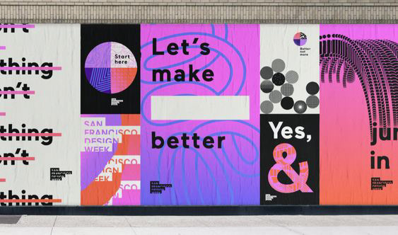



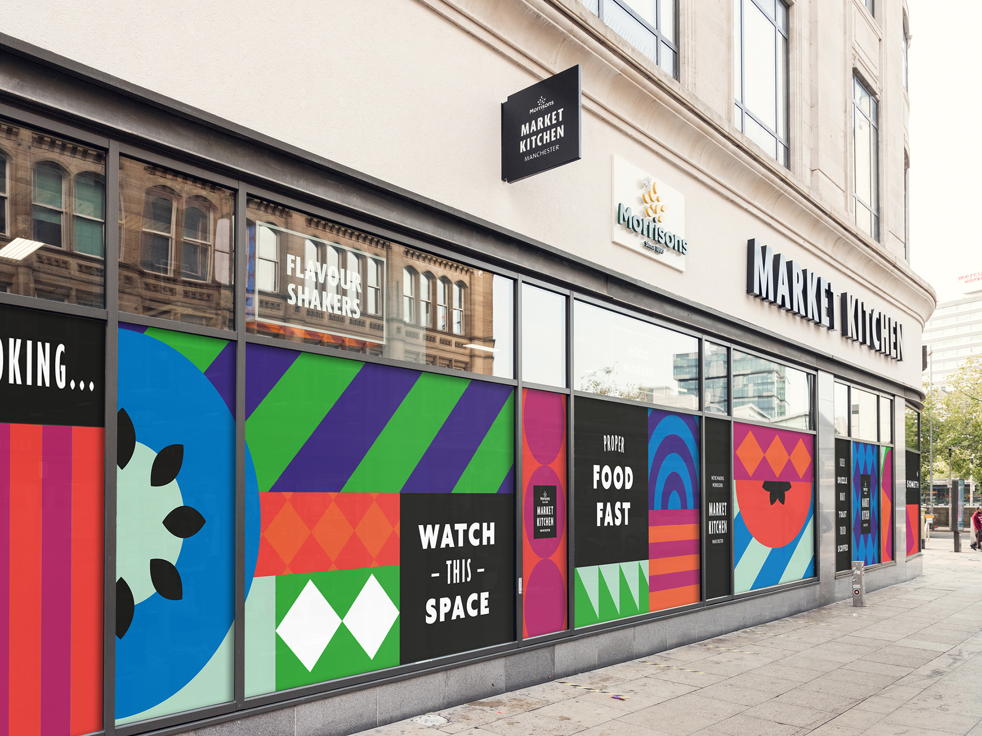

Inspiration and sketching. Three concepts were developed.
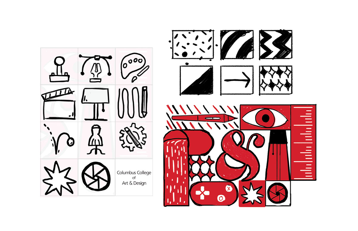
Modular, bold, punchy: How the 11 majors co-exist at CCAD.

No path is linear: You start as a freshman in fashion design, but find illustration to be more of a calling. You carry the skills over to that, and upon graduation, have a unique blend of skills that set you apart from everyone else.

Grand: As the name implies, the Emporium is extravagant and theatrical, a destination for artists.
Using CCAD's existing brand guidelines as a starting point, I built a modular visual language that is cohesive, dynamic, and punchy. Utilizing the grid allows for categorization of each of the colleges 11 majors to be represented.