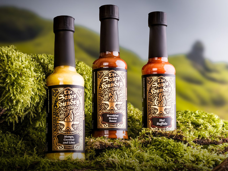
Fyre
Hot sauce goes medieval for a modern audience.
Hot sauce goes medieval for a modern audience.
Identity
Packaging
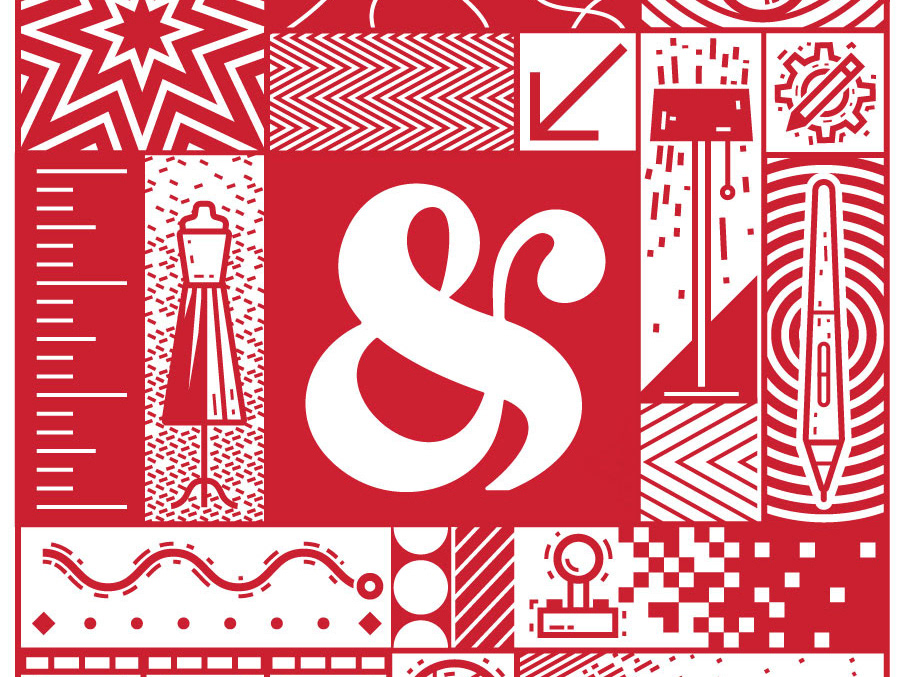
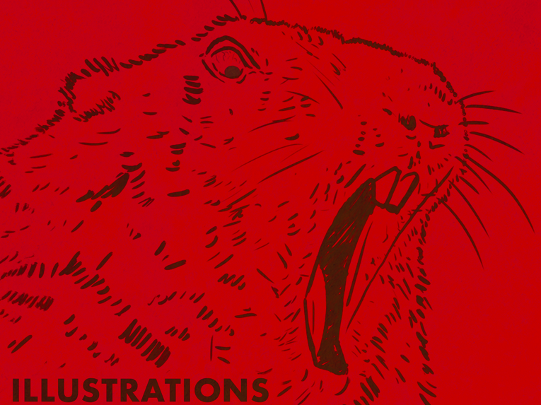
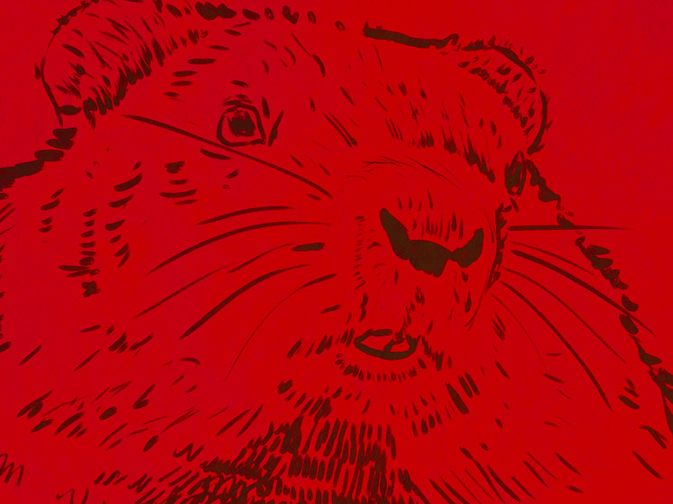
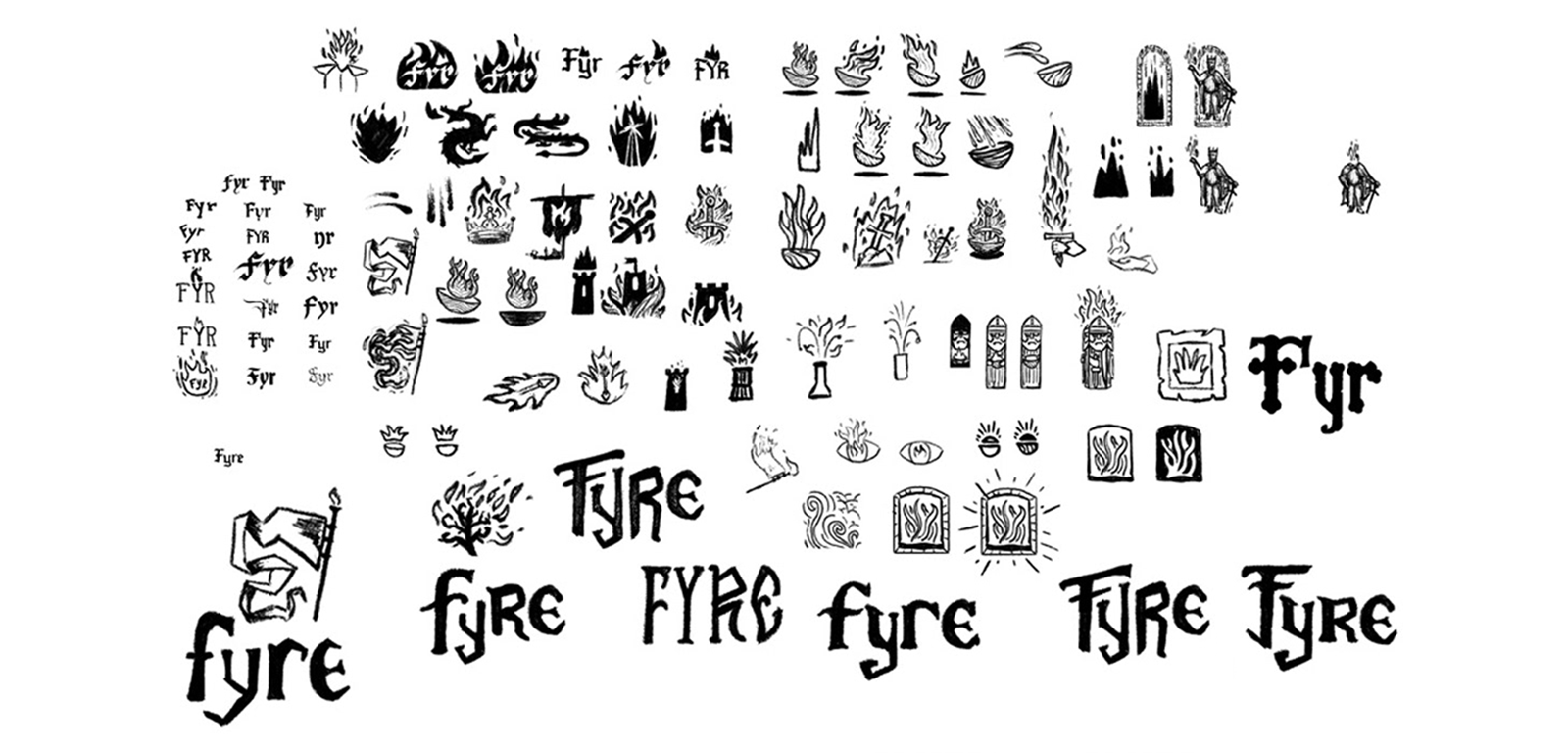
Illustration
Student Silver Addy — Logo Design
Student Silver Addy — Packaging
Packaging
Illustration
Student Silver Addy — Logo Design
Student Silver Addy — Packaging
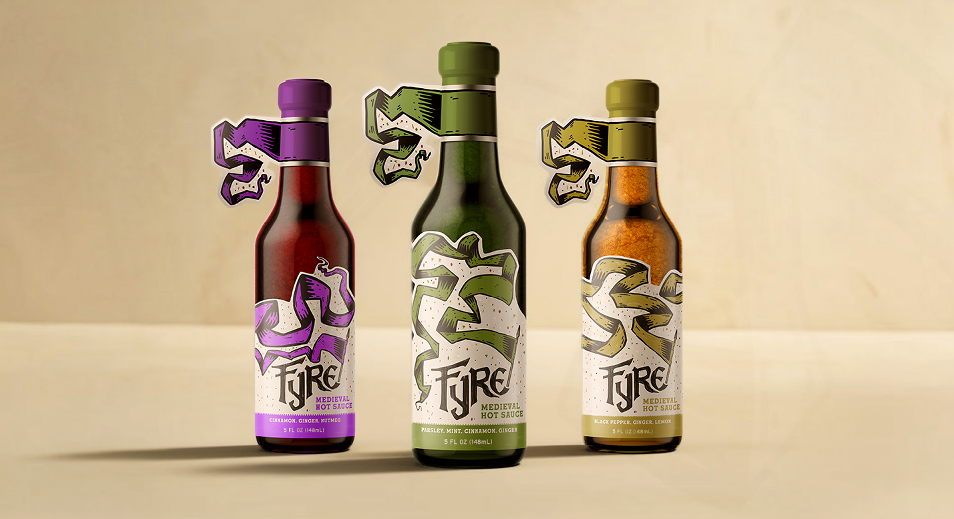
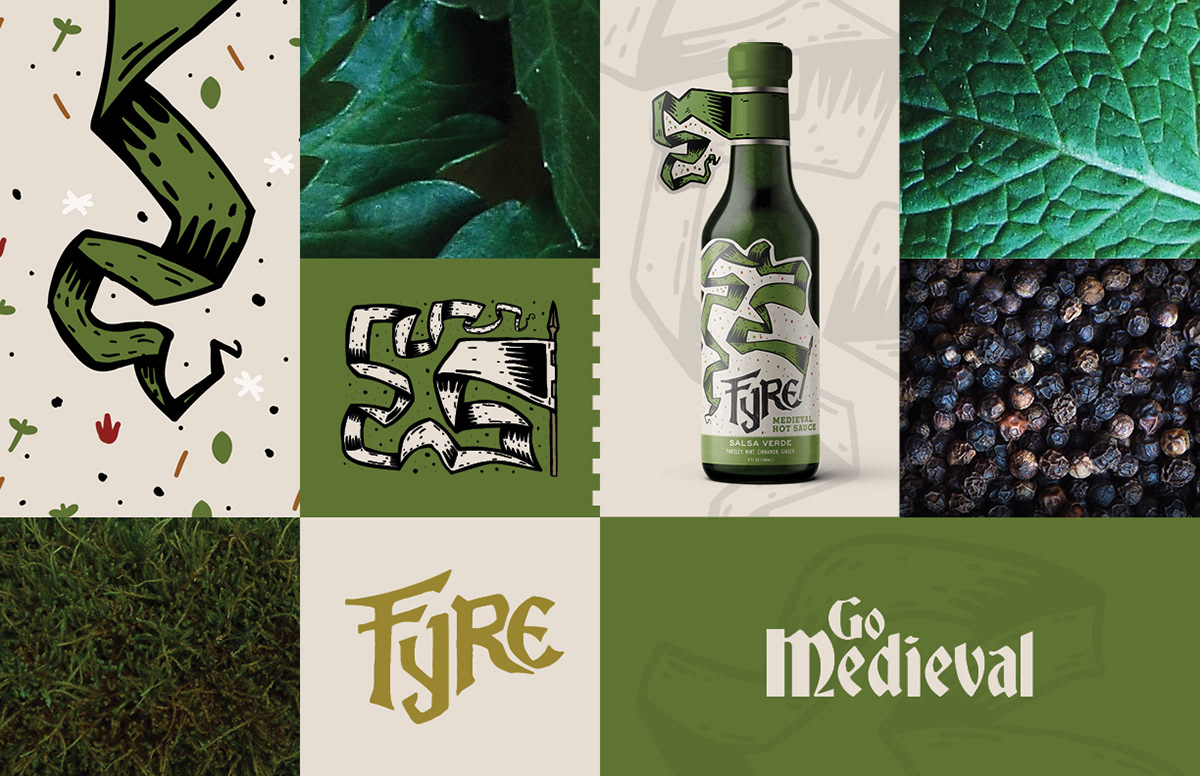
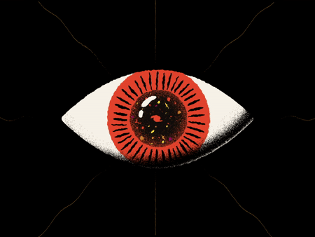
Fyre is a conceptual hot sauce brand that revives the bold, earthy flavors of Medieval Europe for the adventurous modern palate. Instead of relying on chili heat alone, Fyre uses authentic historical ingredients like black pepper, vinegar, saffron, and cinnamon to deliver a noble, festive taste experience rooted in centuries-old tradition.
CHALLENGE
In a crowded hot sauce market dominated by bright labels and extreme heat challenges, there was an opportunity to create something completely different — a unique, story-driven brand that stands apart through historical roots. The project required developing a full identity and packaging system that felt ownable and visually striking while appealing to curious food enthusiasts seeking more than just spiciness.
INSIGHT
Medieval banquets were celebrations of fire, flavor, and feasting. By drawing on this rich history rather than modern hot sauce tropes, we could position Fyre as a noble, flavorful alternative — adding sauce into a meal is now a historical and sensory experience.


APPROACH
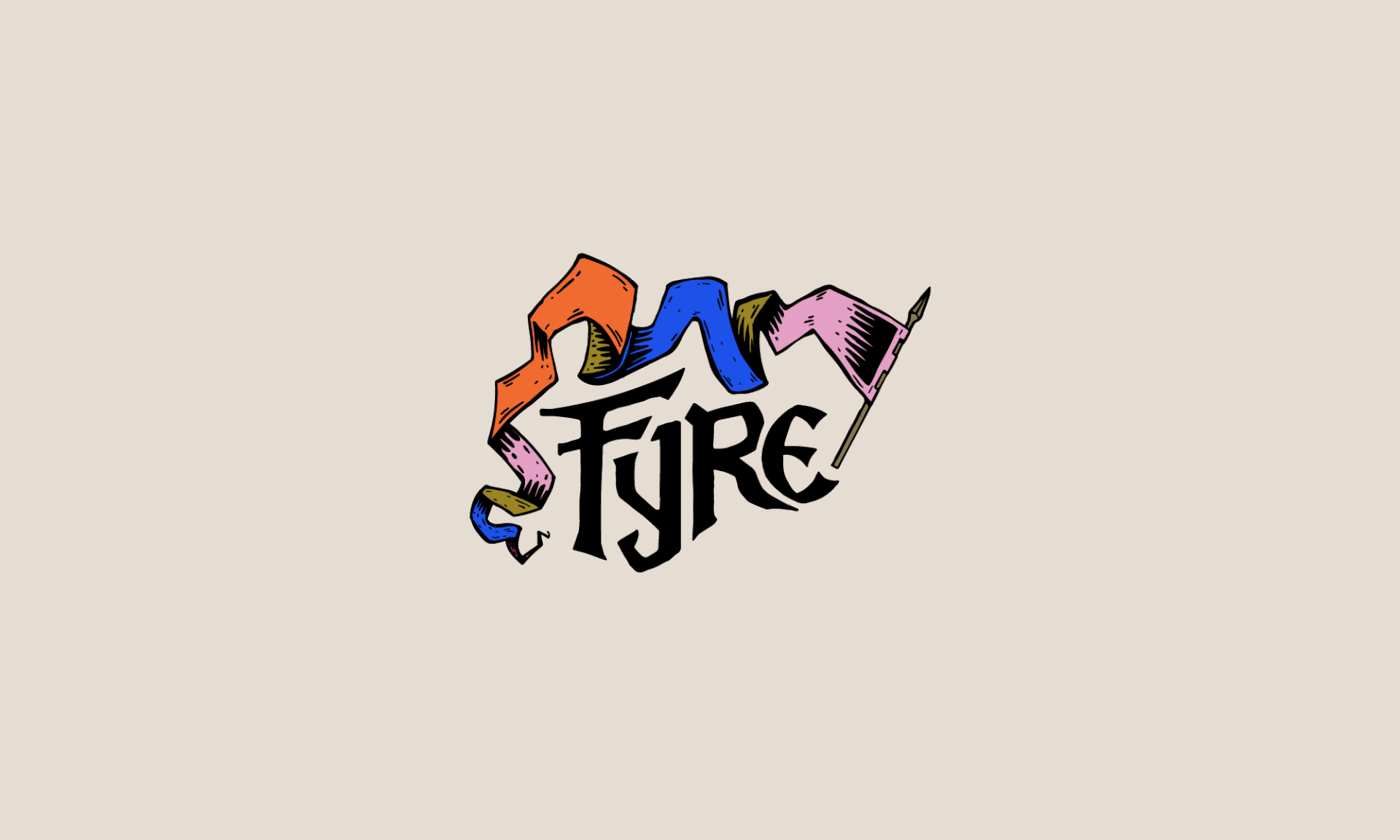
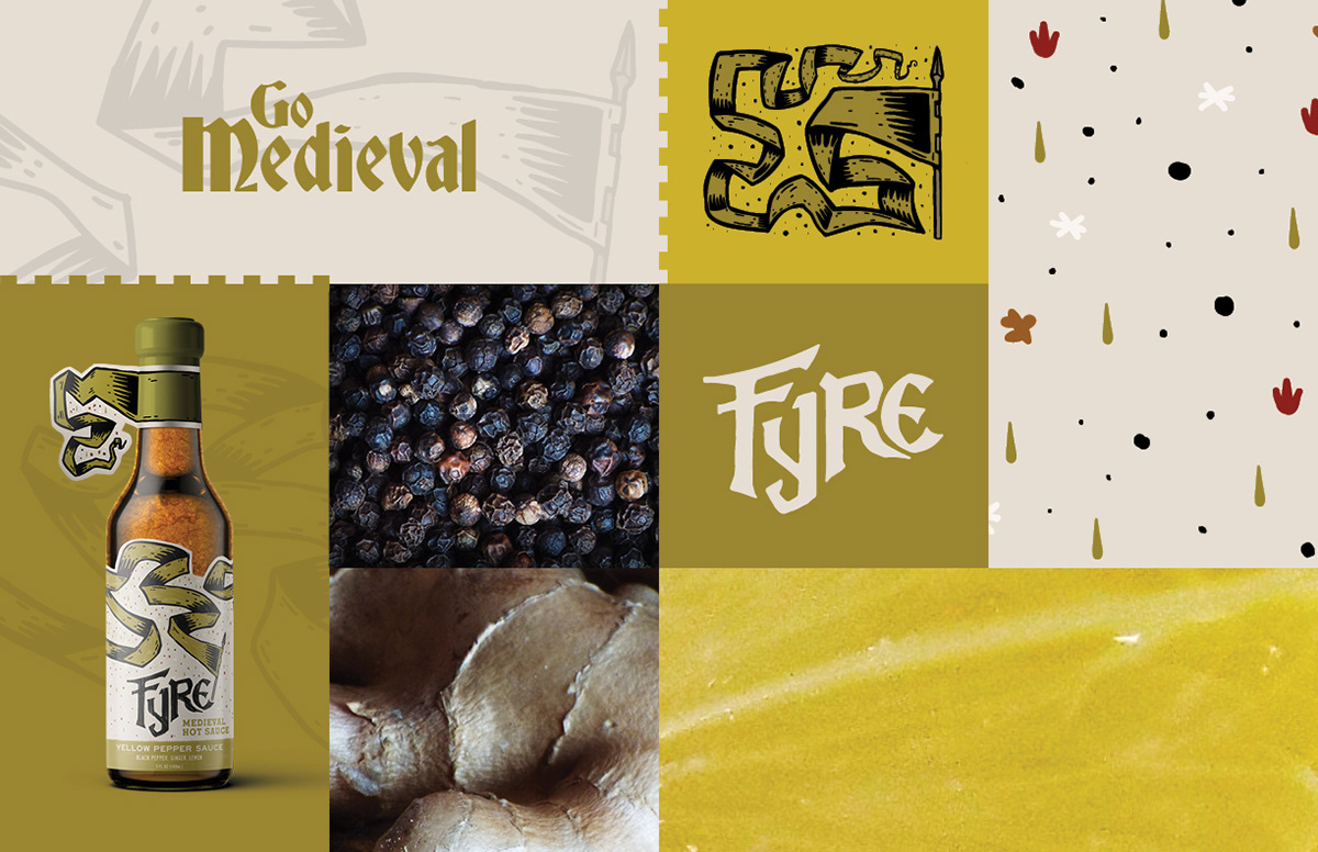
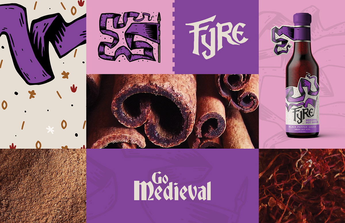
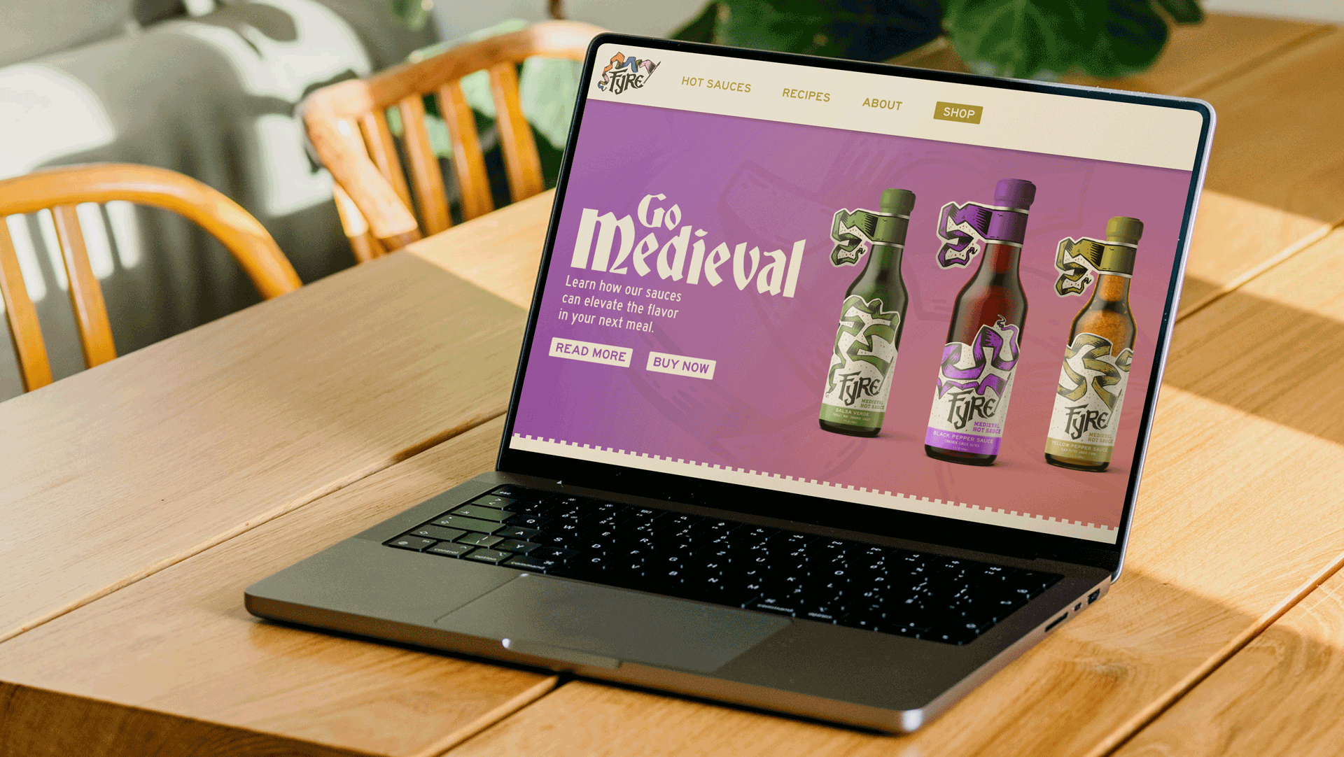
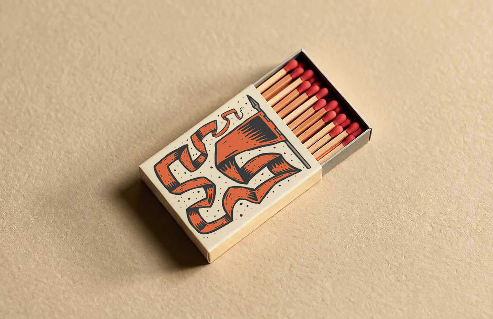
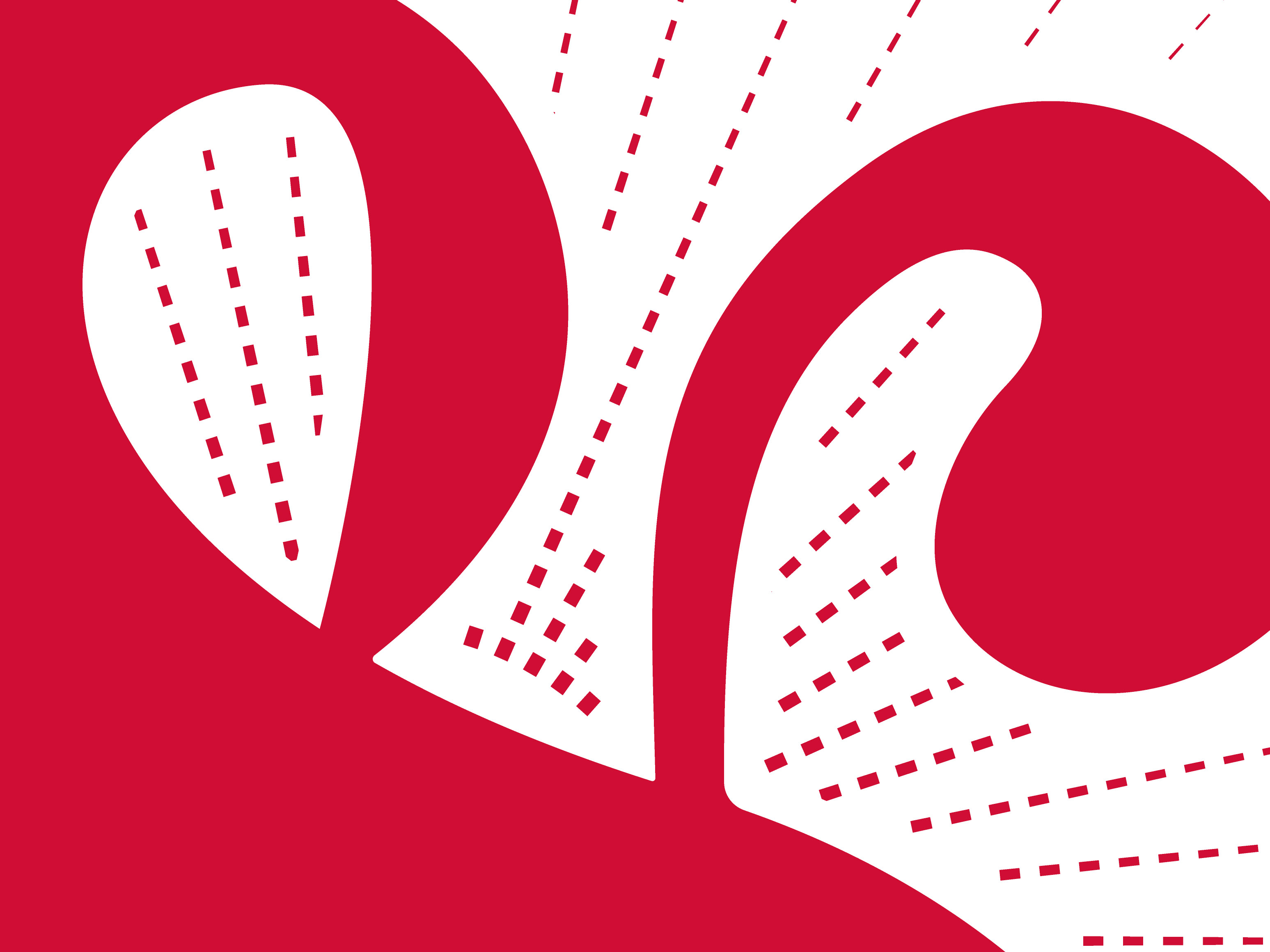
I built the entire brand around a medieval flag motif. A waving flag became the central visual element — its mangled, contorted shapes in the wind representing the bold, tart flavors of the sauces, with hidden flame imagery incorporated into the shading.
This concept evolved into a highly flexible, variable logo system. The flag adapts infinitely in shape and form, creating a dynamic identity that brings energy and uniqueness to every application.
The result is a cohesive, award-winning identity that feels timeless, fiery, and distinctly different from anything else on the shelf.