The Sauce Foundry
Luxury artisan condiments with medieval flair.
Luxury artisan condiments with medieval flair.
Identity
Illustration
Packaging
Web + Digital
Illustration
Packaging
Web + Digital
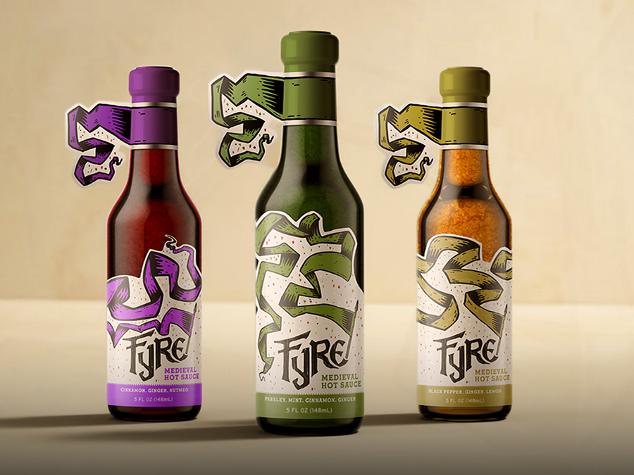
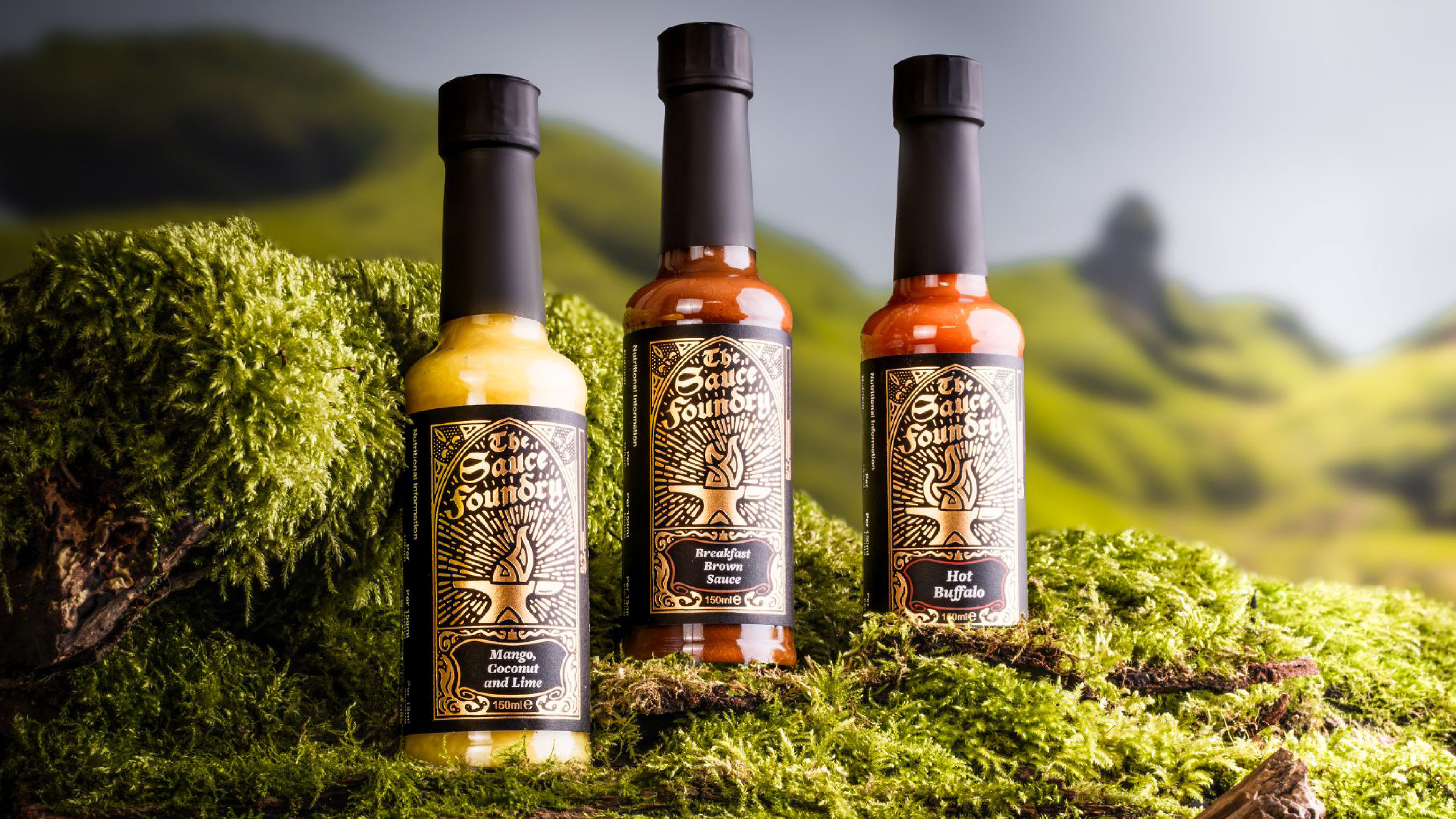
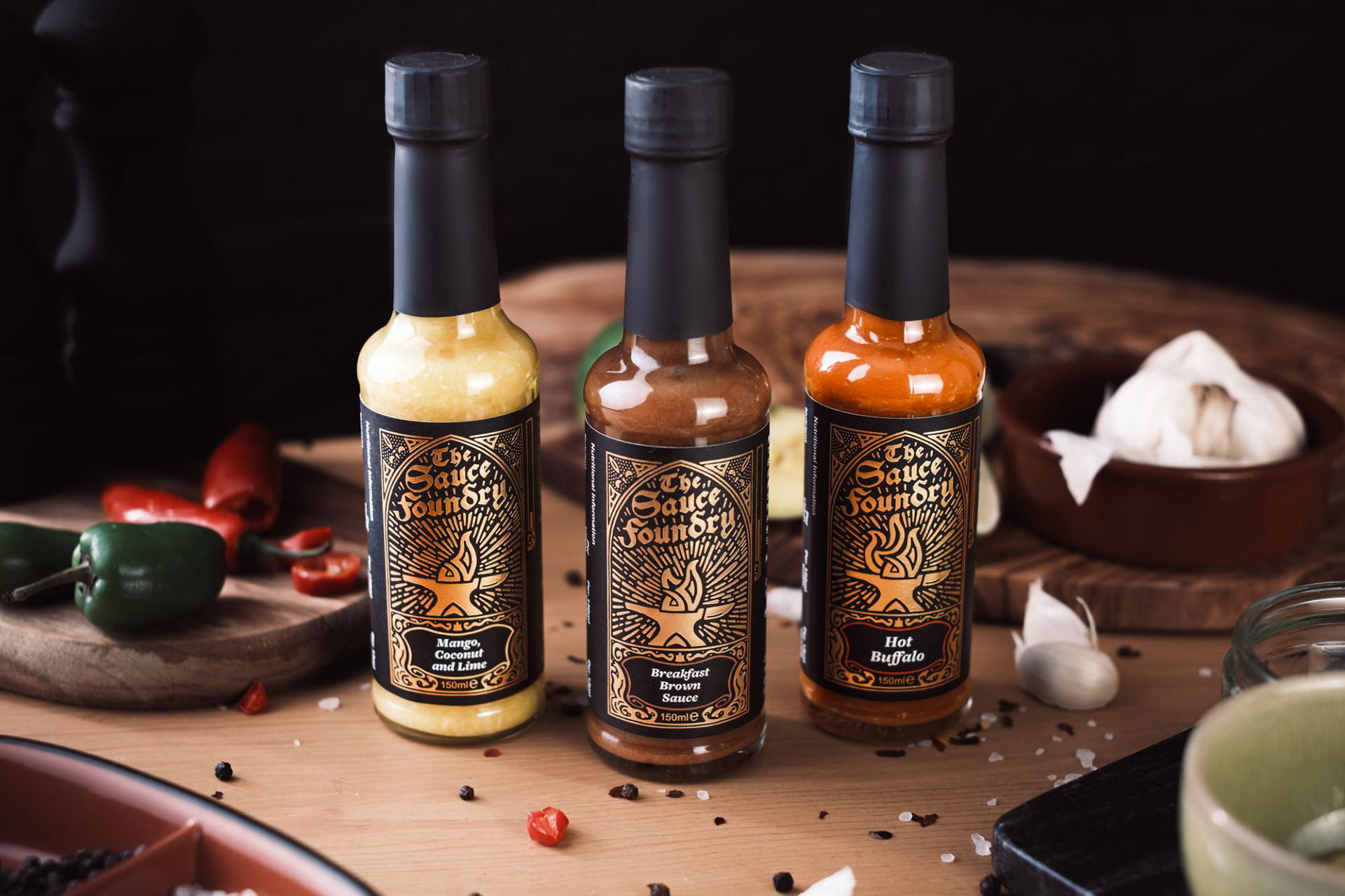
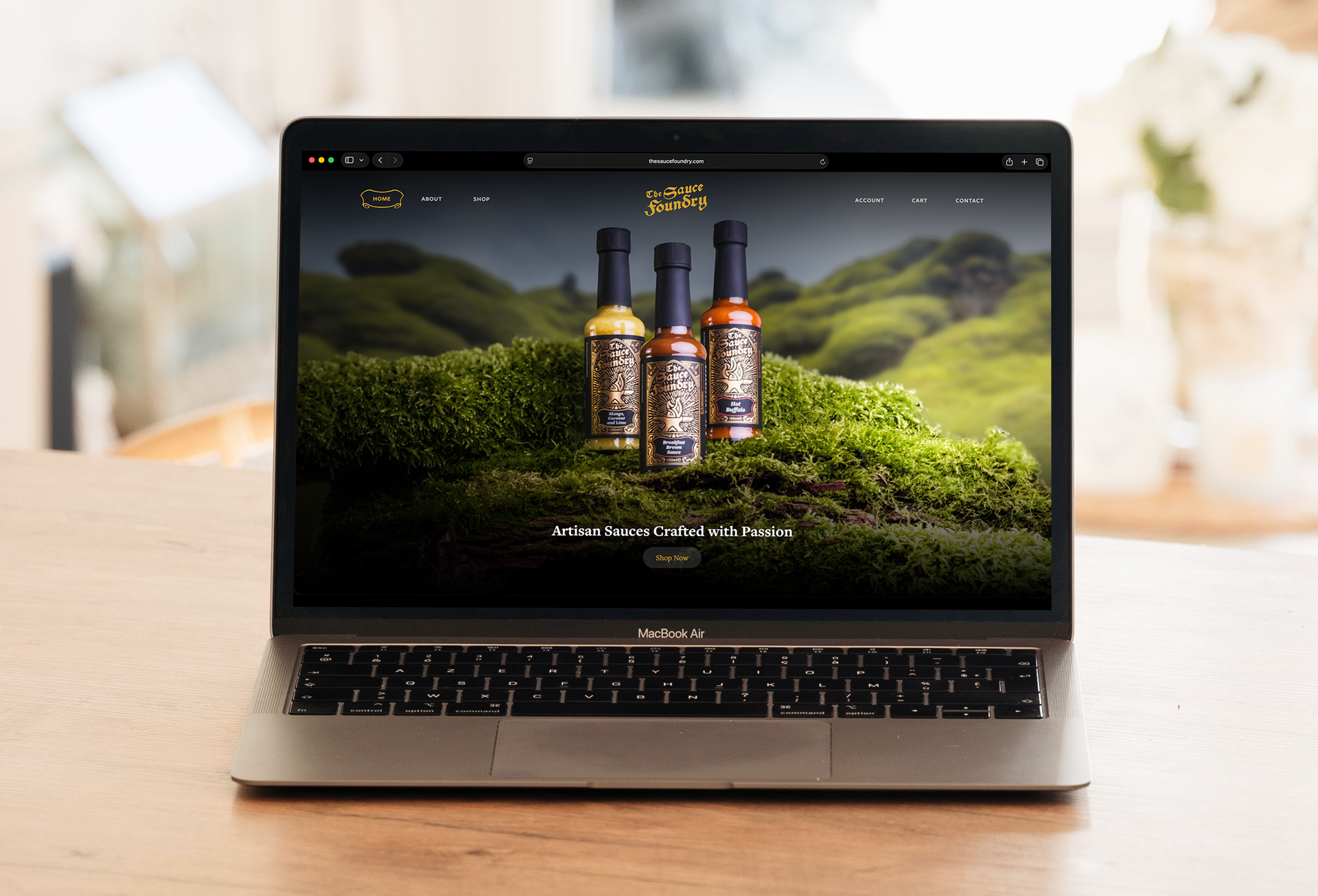
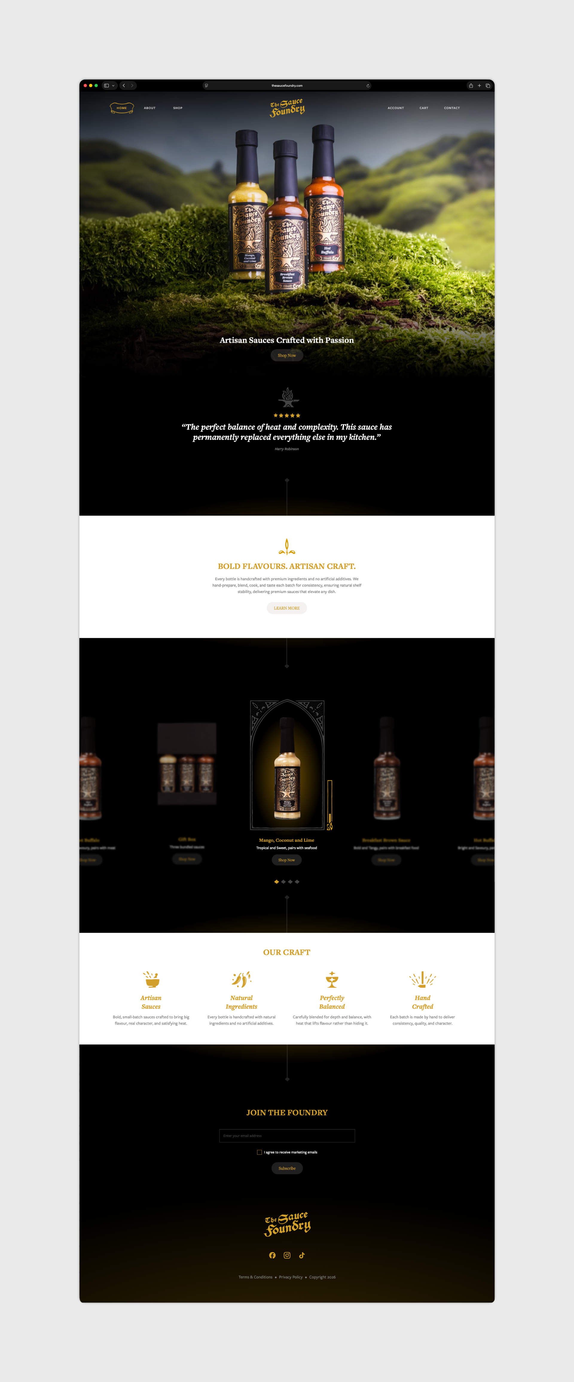
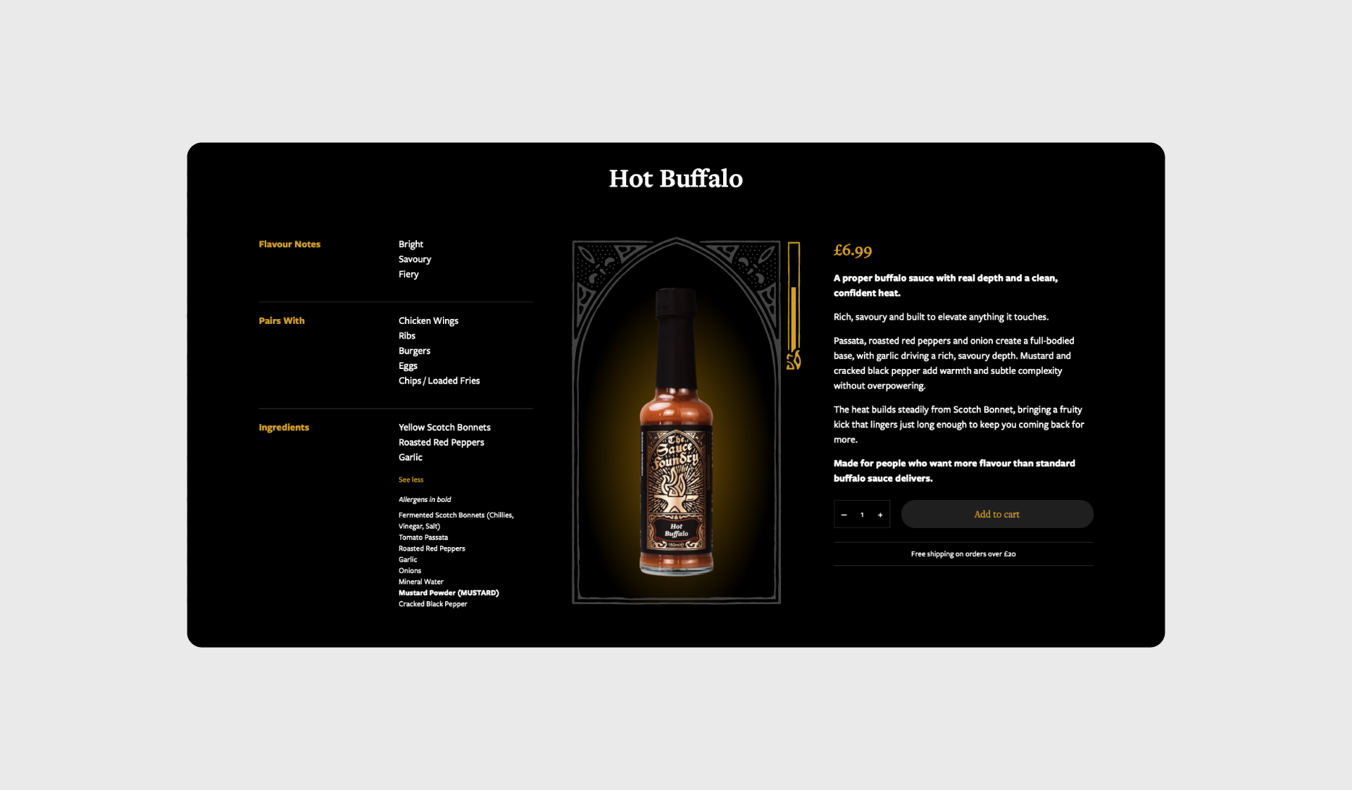
The Sauce Foundry is a UK-based range of luxury artisan condiments. Rather than leaning into the typical loud, novelty-driven hot sauce aesthetic, I created a refined, heritage-rich brand identity and packaging system that elevates the products into something timeless and story-driven. Drawing on English medieval craftsmanship and the imagery of the forge, the brand turns fiery heat into a vessel for quality, artistry, and excellence.
CHALLENGE
In a saturated gourmet food market filled with aggressive and loud hot sauce brands, The Sauce Foundry needed to stand out as a genuinely premium offering. The goal was to appeal to discerning food enthusiasts, chefs, and gift buyers who value craftsmanship, heritage, and depth of flavor. The packaging also needed to work across a growing range of heat levels while supporting future retail plans in medieval castle gift shops across the UK and Europe, positioning the sauces as distinctive, story-rich novelty items that still command premium pricing.
In a saturated gourmet food market filled with aggressive and loud hot sauce brands, The Sauce Foundry needed to stand out as a genuinely premium offering. The goal was to appeal to discerning food enthusiasts, chefs, and gift buyers who value craftsmanship, heritage, and depth of flavor. The packaging also needed to work across a growing range of heat levels while supporting future retail plans in medieval castle gift shops across the UK and Europe, positioning the sauces as distinctive, story-rich novelty items that still command premium pricing.
INSIGHT
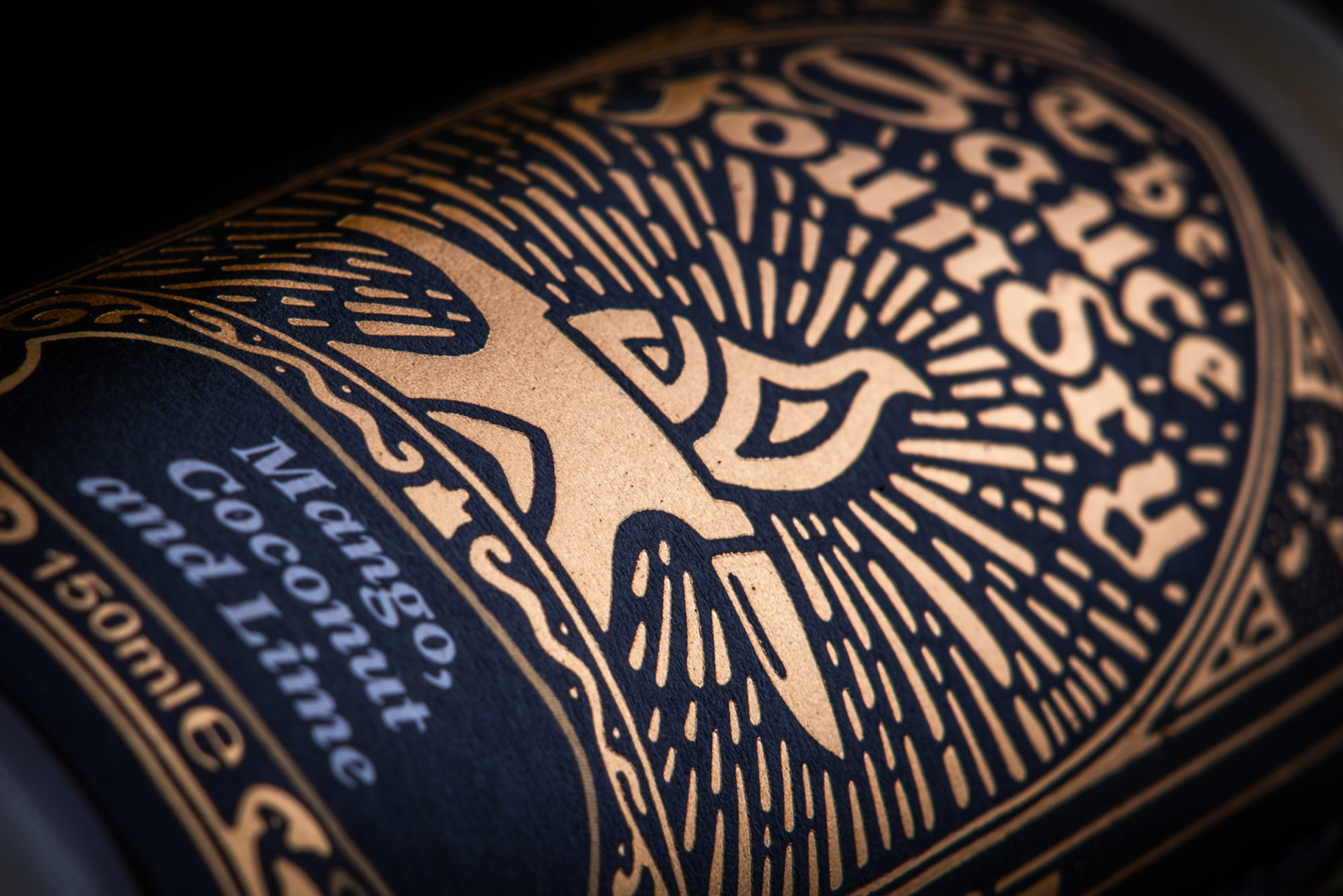
True artisan craftsmanship is about transformation under pressure, the same way metal is forged in fire. The name “Sauce Foundry” already hinted at a blacksmithing metaphor, but the real opportunity was to express it with subtlety and sophistication rather than overt gimmickry.
True artisan craftsmanship is about transformation under pressure, the same way metal is forged in fire. The name “Sauce Foundry” already hinted at a blacksmithing metaphor, but the real opportunity was to express it with subtlety and sophistication rather than overt gimmickry.
APPROACH
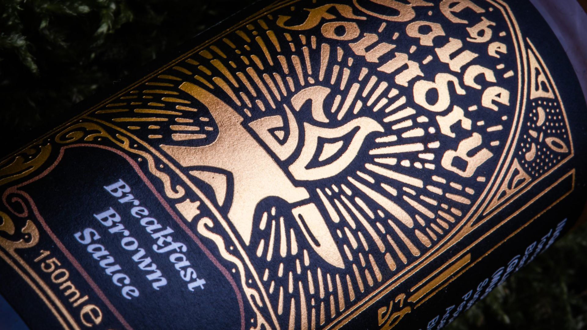
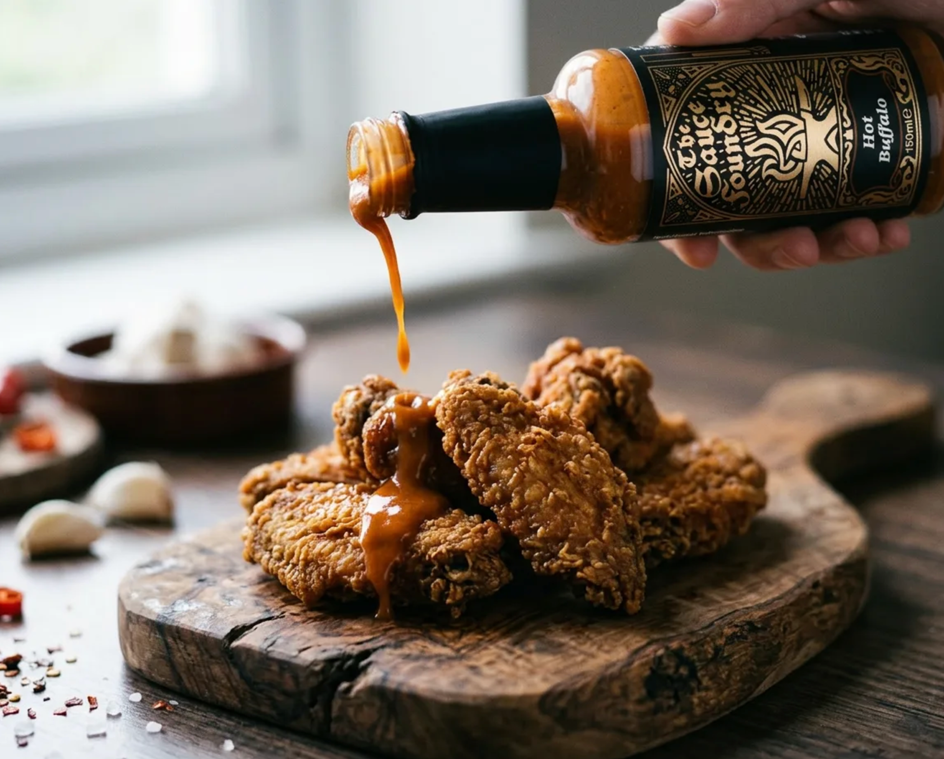
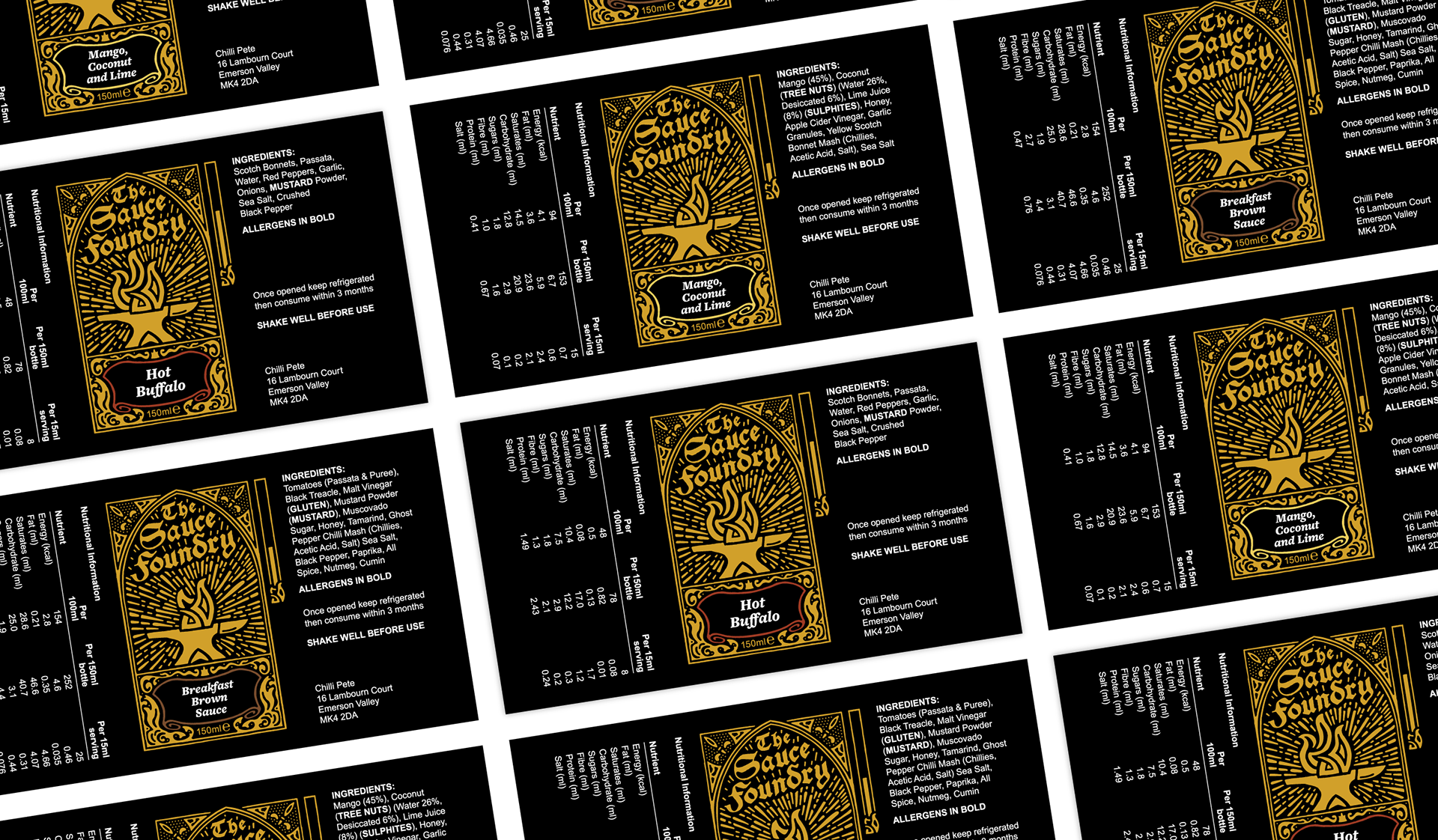
I built the entire identity around the central metaphor of the medieval forge. The hero mark — a flickering Celtic-style flame rising from an anvil — allows for an adaptive logo system: as the heat levels increase across the sauce range, the flames scale in intensity as well. This thoughtful variation creates a cohesive family of labels while delivering small moments of delight and discovery for the customer.
I built the entire identity around the central metaphor of the medieval forge. The hero mark — a flickering Celtic-style flame rising from an anvil — allows for an adaptive logo system: as the heat levels increase across the sauce range, the flames scale in intensity as well. This thoughtful variation creates a cohesive family of labels while delivering small moments of delight and discovery for the customer.

RESULTS
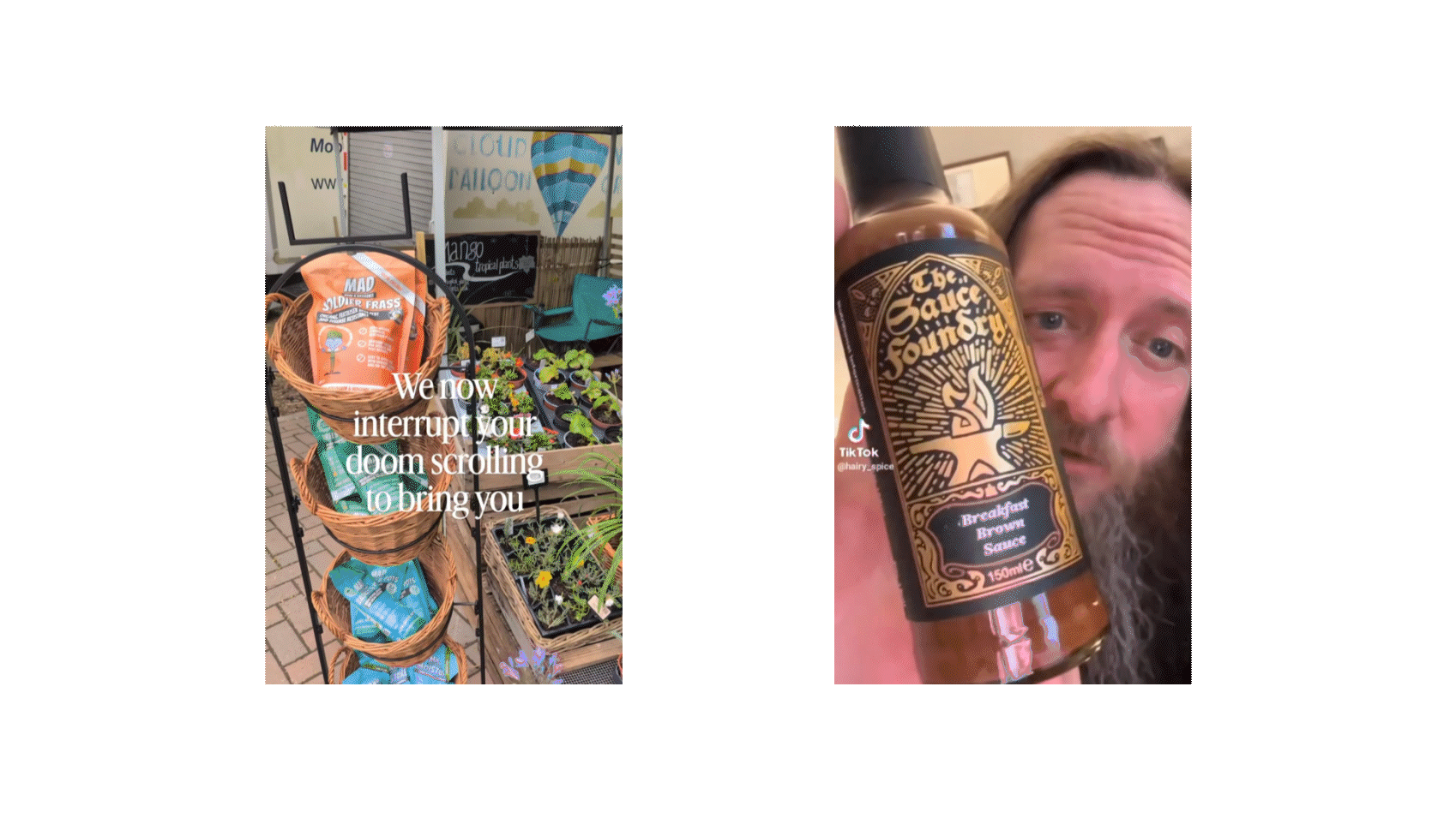
The new product enjoyed a successful soft launch, generating strong initial interest and positive reception from early customers and retailers.
The new product enjoyed a successful soft launch, generating strong initial interest and positive reception from early customers and retailers.