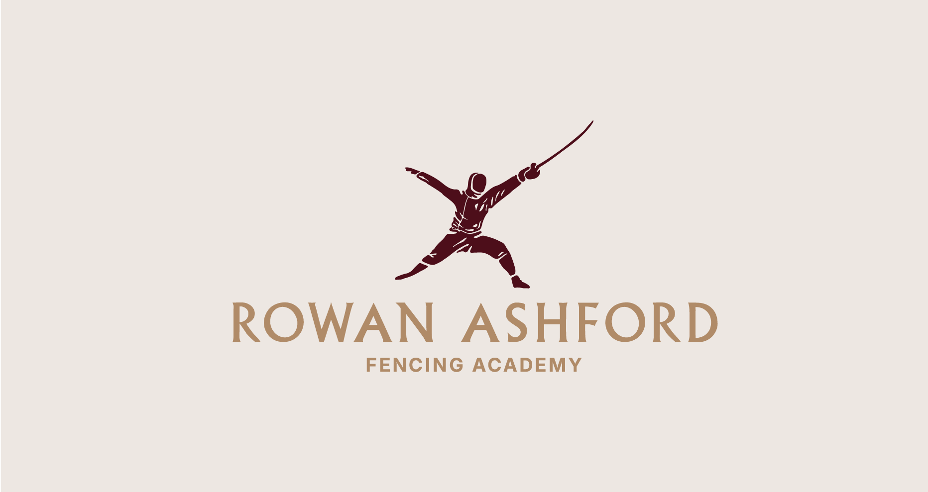
Rowan Ashford Fencing Academy
Becoming the protagonist of your own myth.
Becoming the protagonist of your own myth.
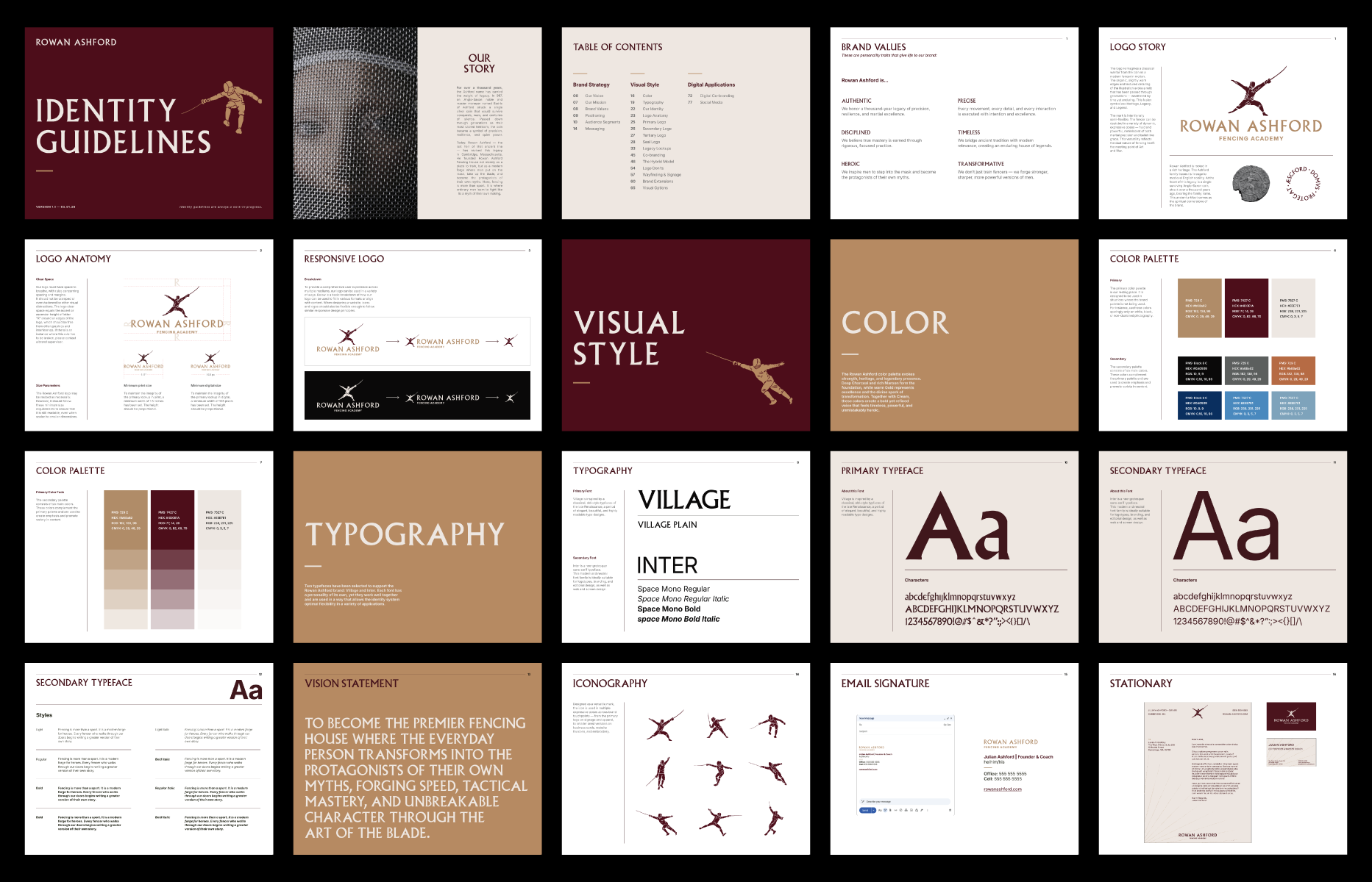
Identity
Web + Digital
Print
Motion
Copywriting
Naming
Experience
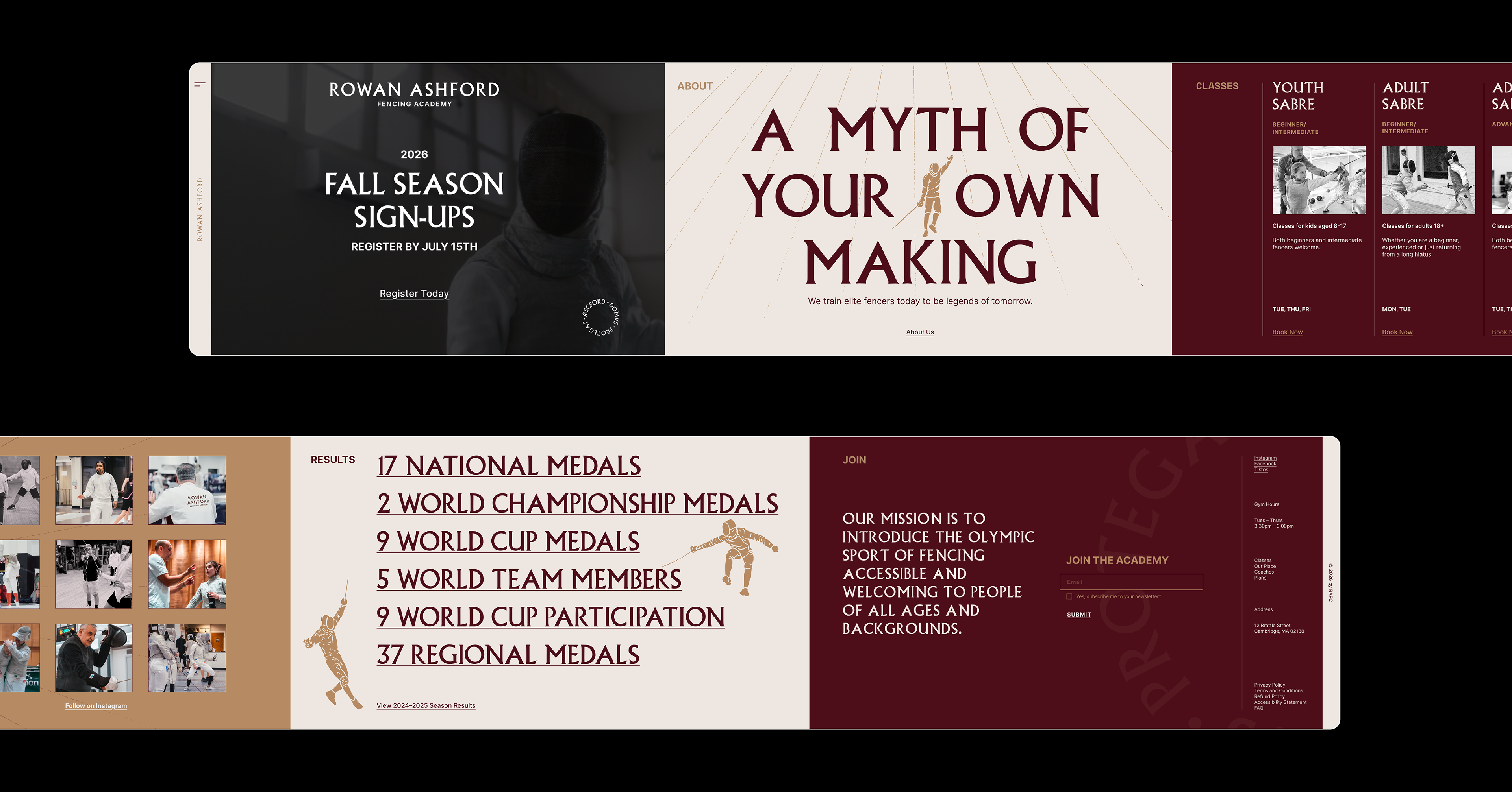
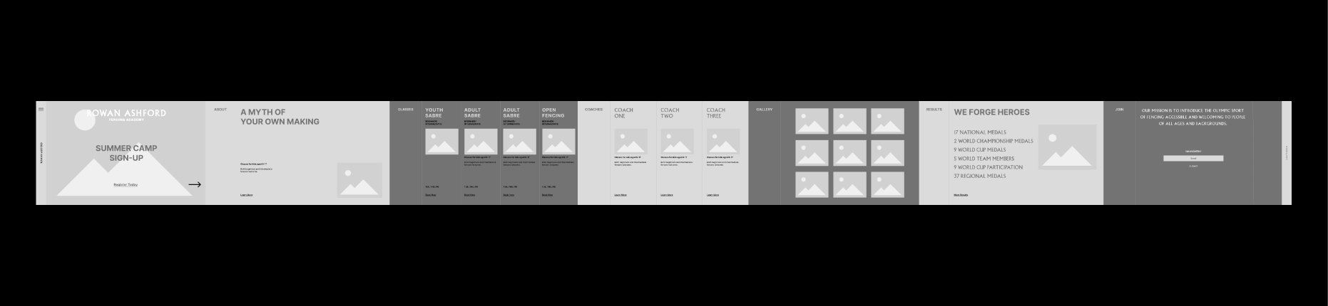
Web + Digital
Motion
Copywriting
Naming
Experience
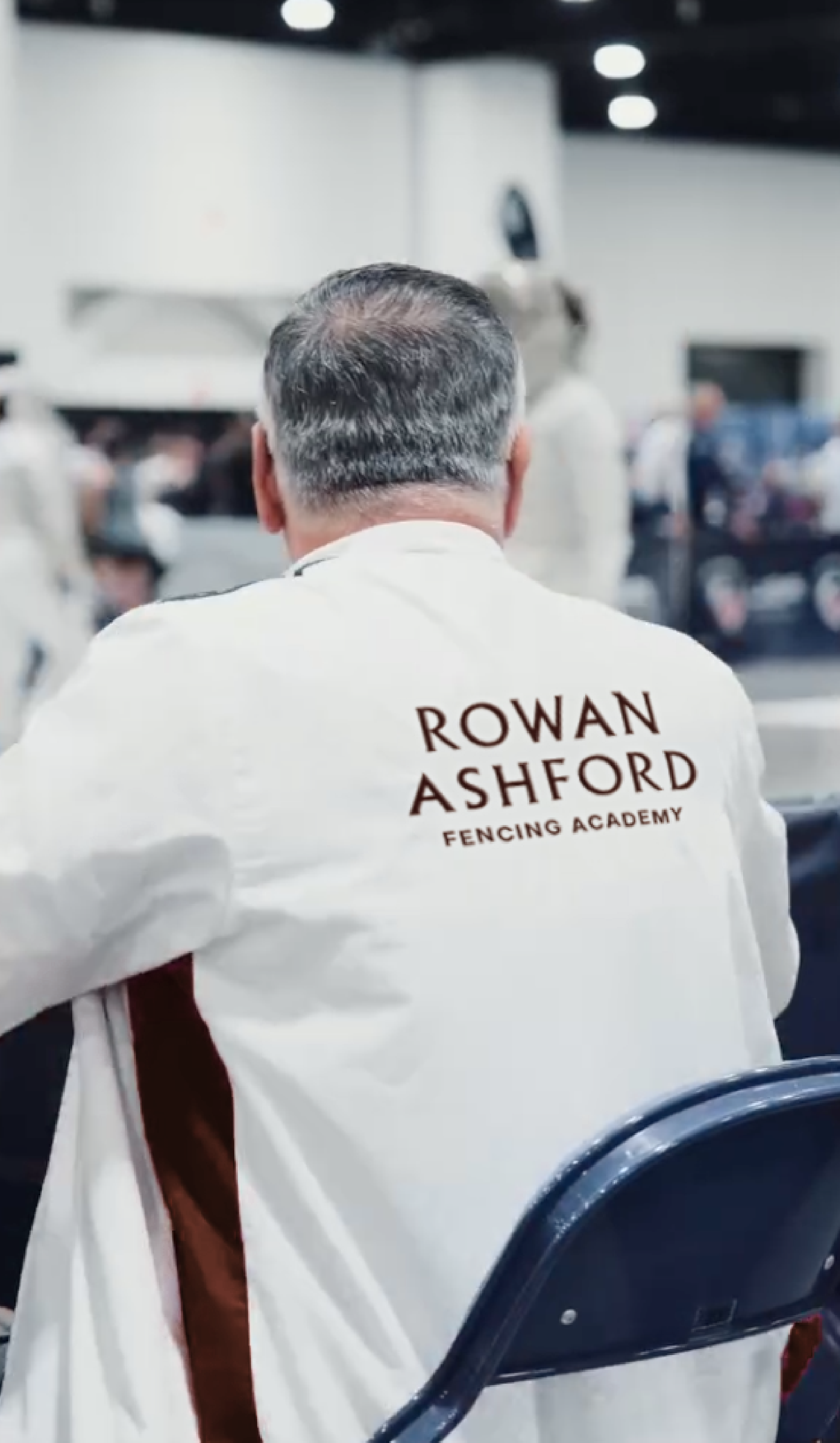
Rowan Ashford is a high-end fencing academy in Cambridge, Massachusetts, founded by former international competitor Rowan Ashford. Rather than positioning the academy as another intense training facility, we created a refined, narrative-driven identity that elevates fencing into a modern hero’s journey. Here, disciplined men and women don't just train to compete, but train in the spirit of a classical hero.
CHALLENGE
In a crowded fitness and combat sports market dominated by motivational “grind” messaging, Rowan Ashford needed to stand apart as a premium, almost ritualistic experience. The goal was to attract high-achieving professionals and serious athletes in their 20s–30s who crave deeper meaning, community, and personal transformation.
INSIGHT
Fencing is one of the few modern activities that allows people to literally step into the role of a classical hero. The mask becomes a threshold. The blade becomes a tool of self-mastery. For the target audience, the sport offers a rare opportunity to feel like the protagonist of their own myth in an increasingly ordinary world.

APPROACH
We built the entire identity around this idea: fencing as a modern hero's journey.
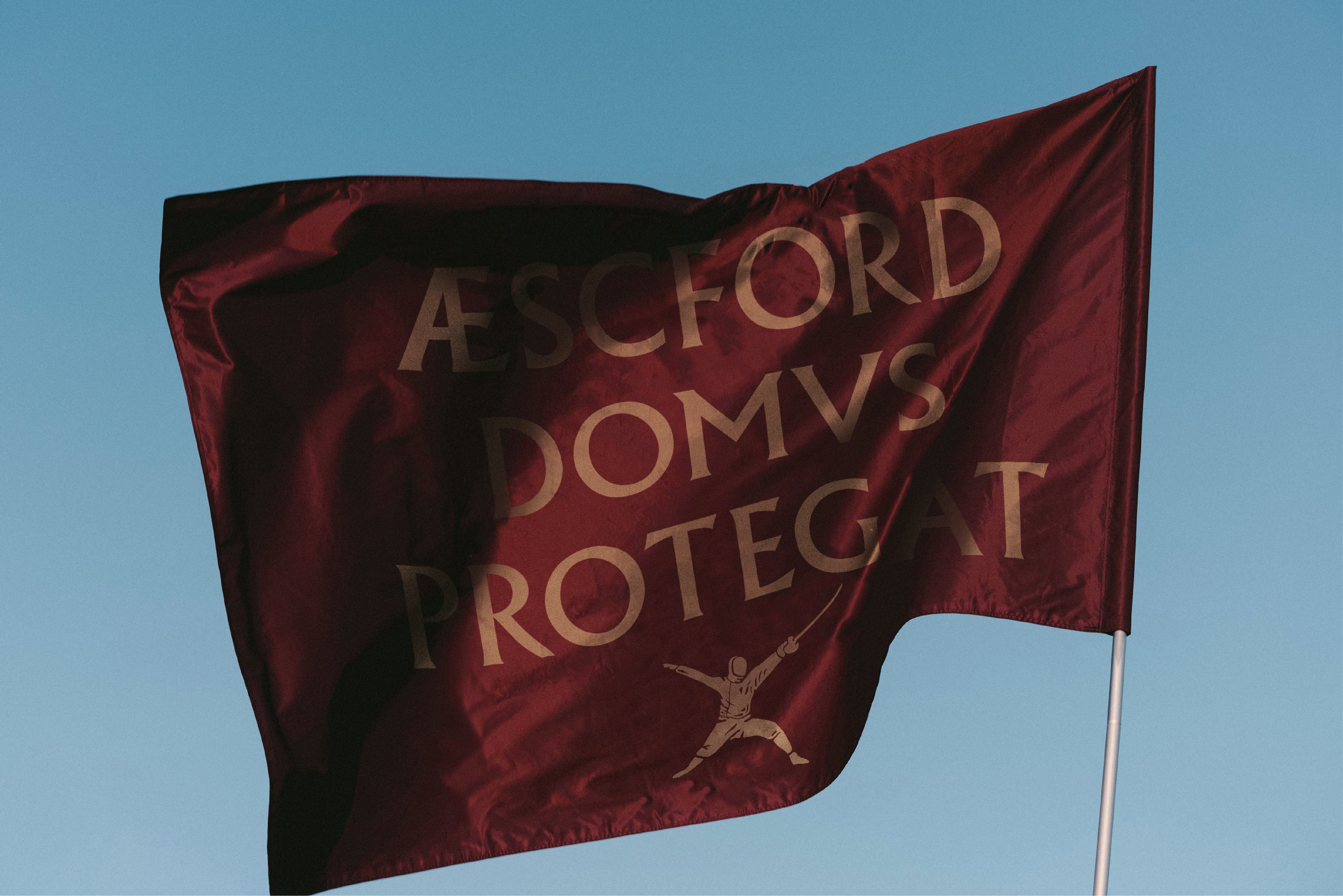
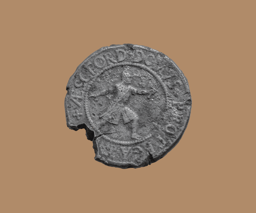
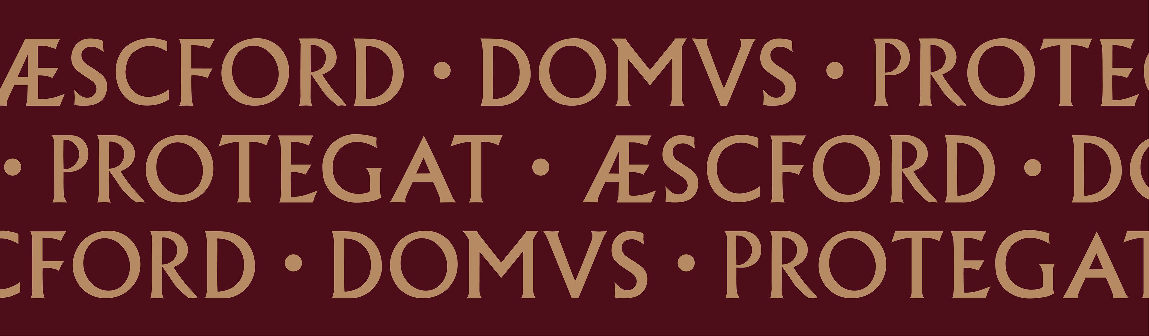
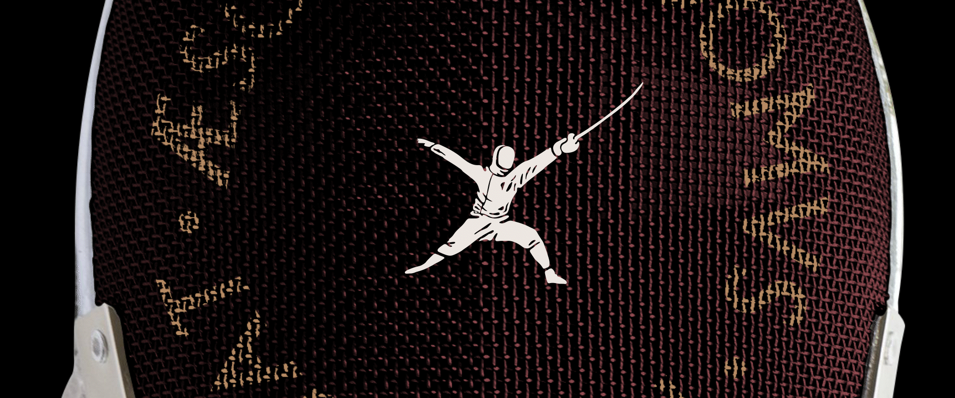
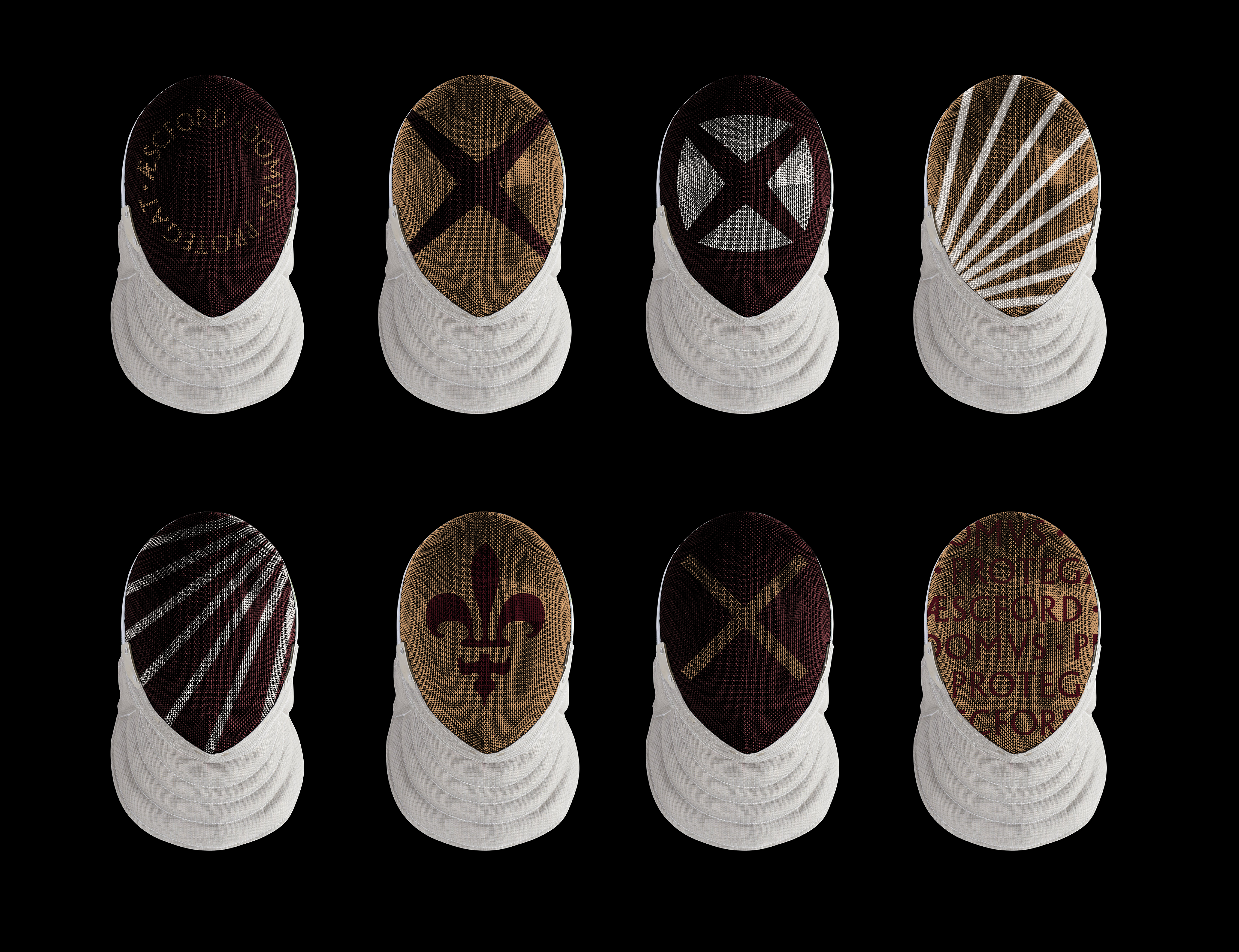
At the center lies a rare minted coin passed down from the Ashford family for over a millennium, bearing a warrior figure with the inscription ÆSCFORD DOMVS PROTEGAT (roughly translating to "House of Ashford Protects"). It serves as a powerful symbol of strength, heritage, and an enduring legacy. This inspired an identity that positions the academy as a spiritual successor to the historic lineage of the Ashford family.
VISUAL LANGUAGE
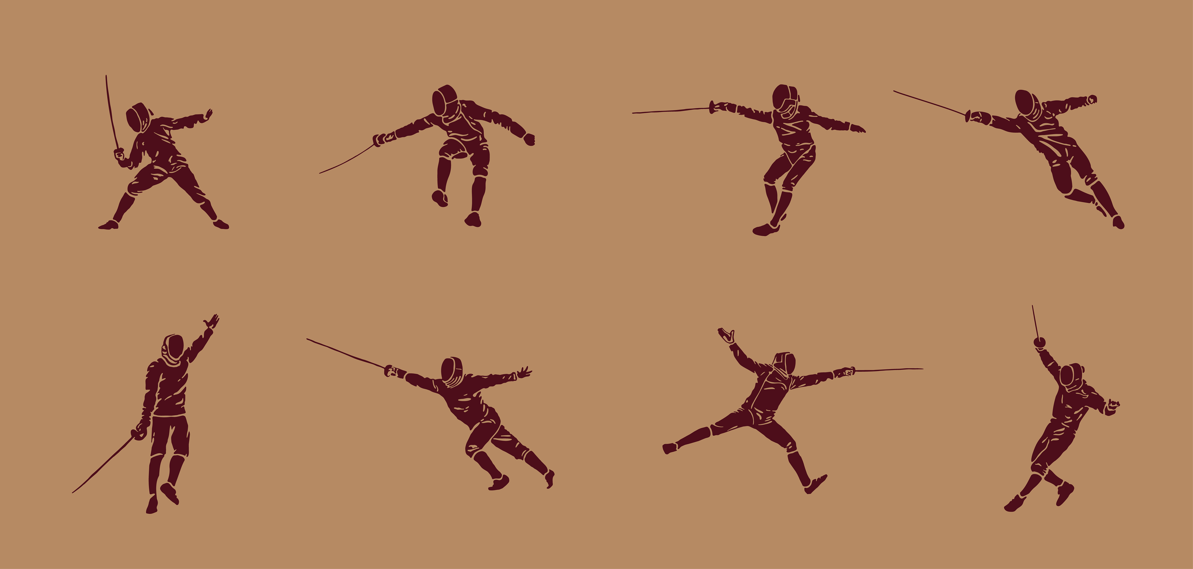
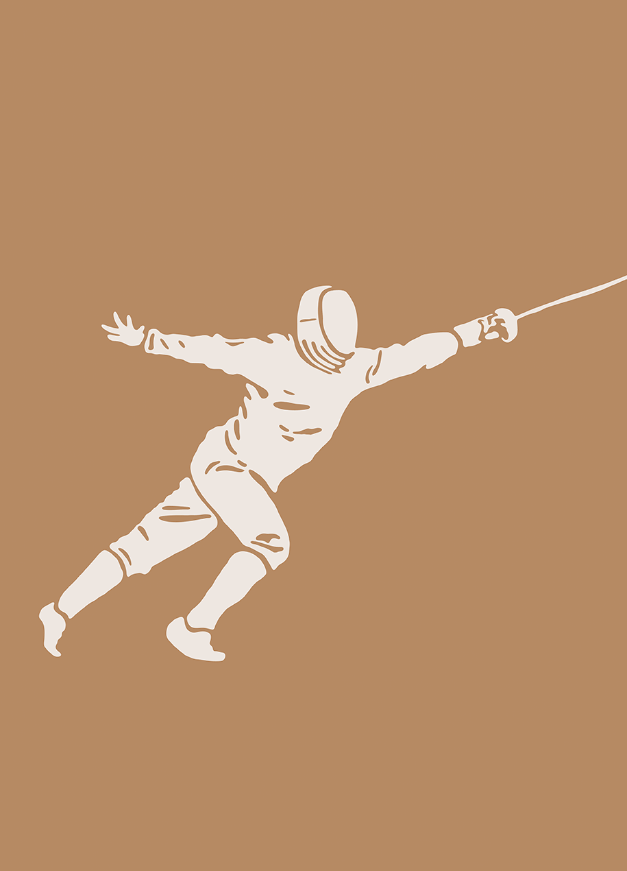
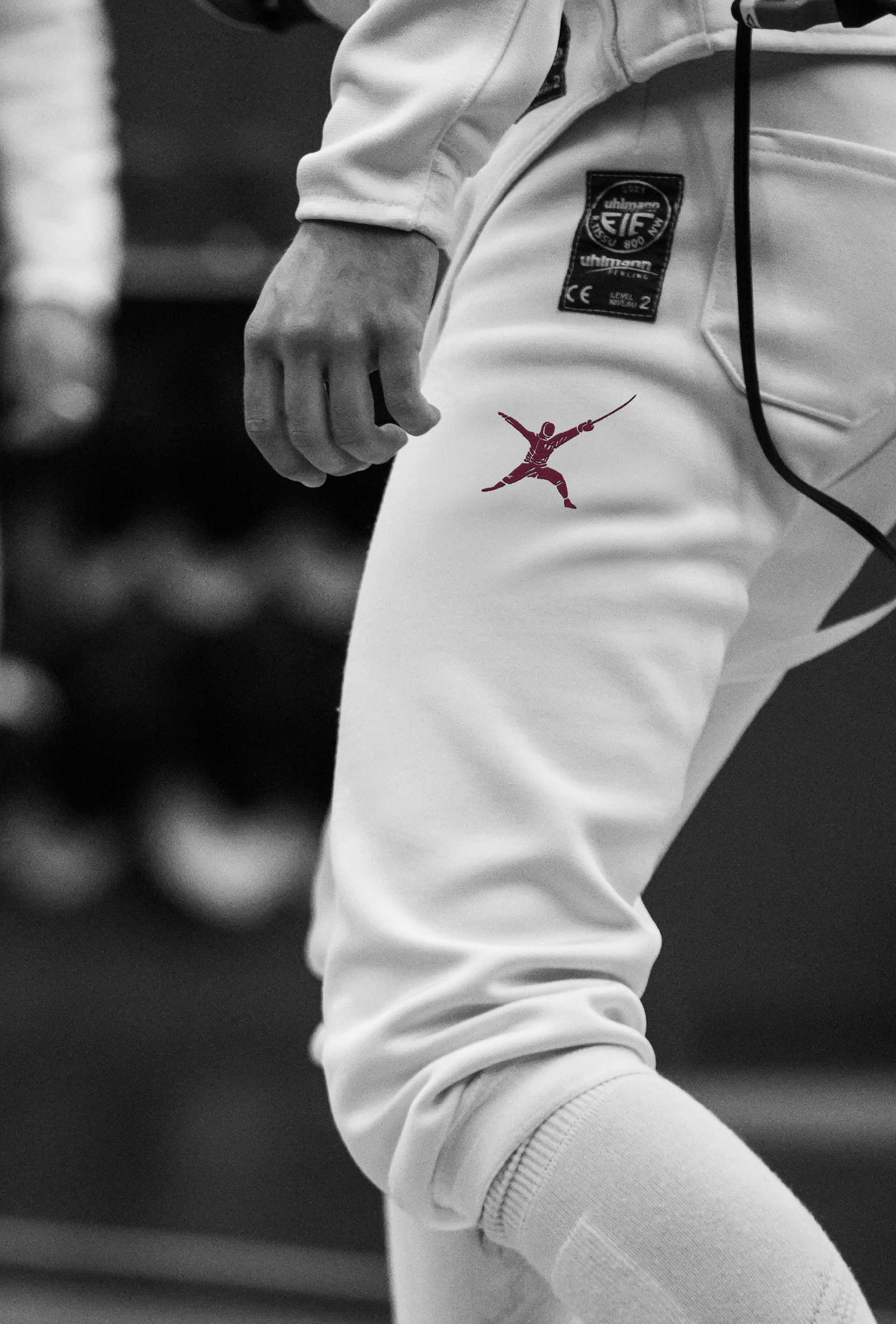
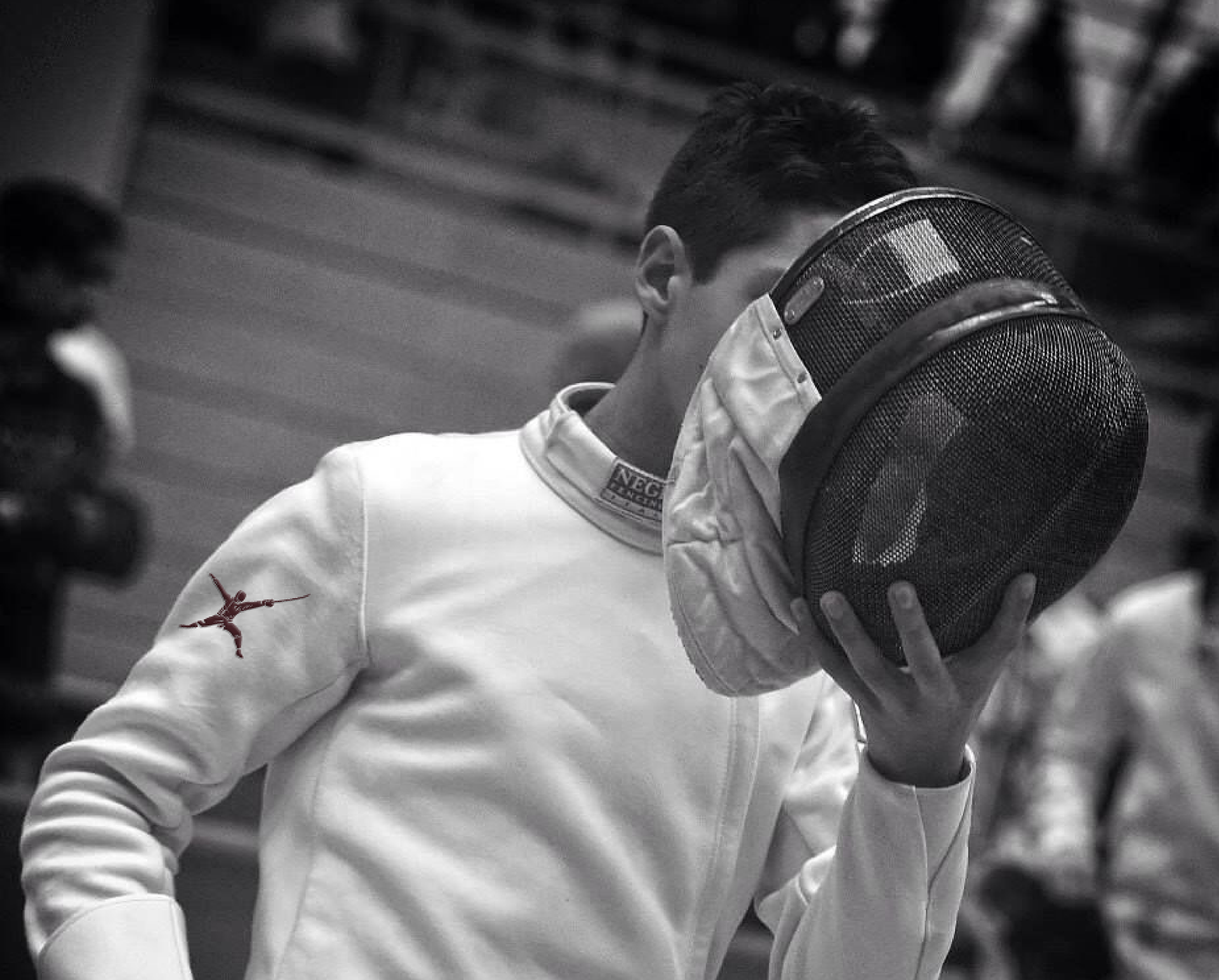
The brand’s sophisticated visual language inspires ambitious individuals to train in the spirit of the classical hero. The fencer is shown lunging forward, sword raised to the sky and opposite arm extended with grace and elegance. The faceless mask invites every viewer to project themselves into the moment, becoming the protagonist in a story of their own making.
The illustration style takes cues from the worn, rubbed, and organic textures of the ancient coin, a deliberate nod to its thousand-year heritage.


MESSAGING
As a combat sport, the stakes are life or death. Reaching the top requires all of you.
The messaging positions fencing a noble path of growth, focus, consistency, and transformation.
As a combat sport, the stakes are life or death. Reaching the top requires all of you.
The messaging positions fencing a noble path of growth, focus, consistency, and transformation.
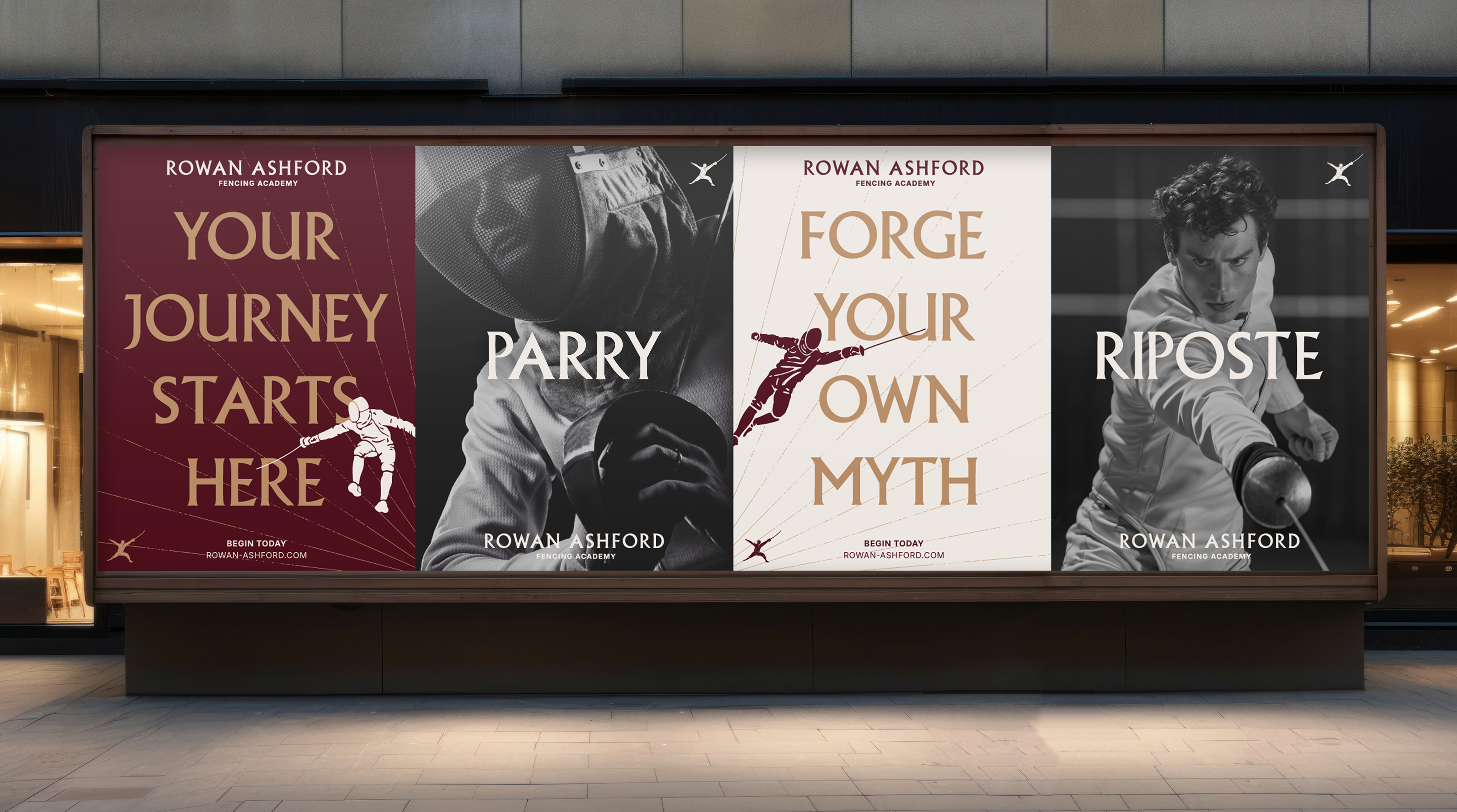
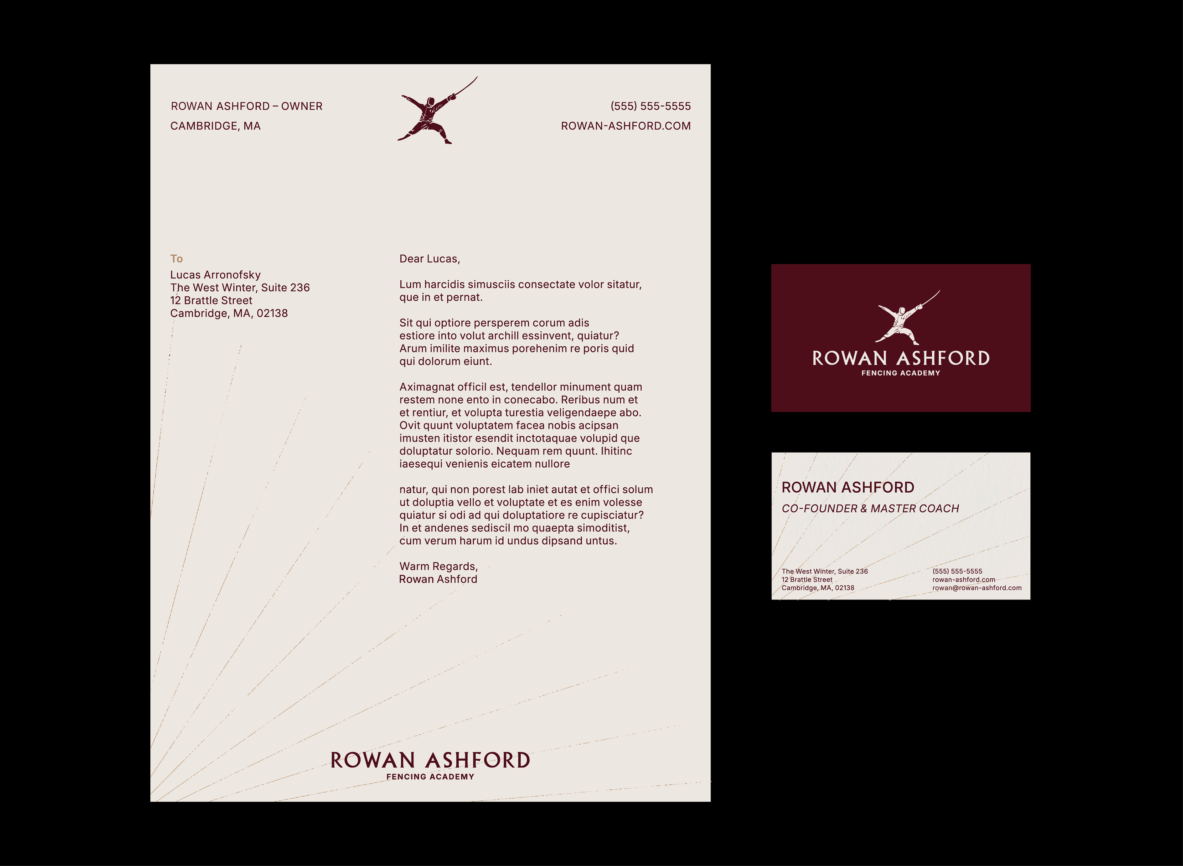
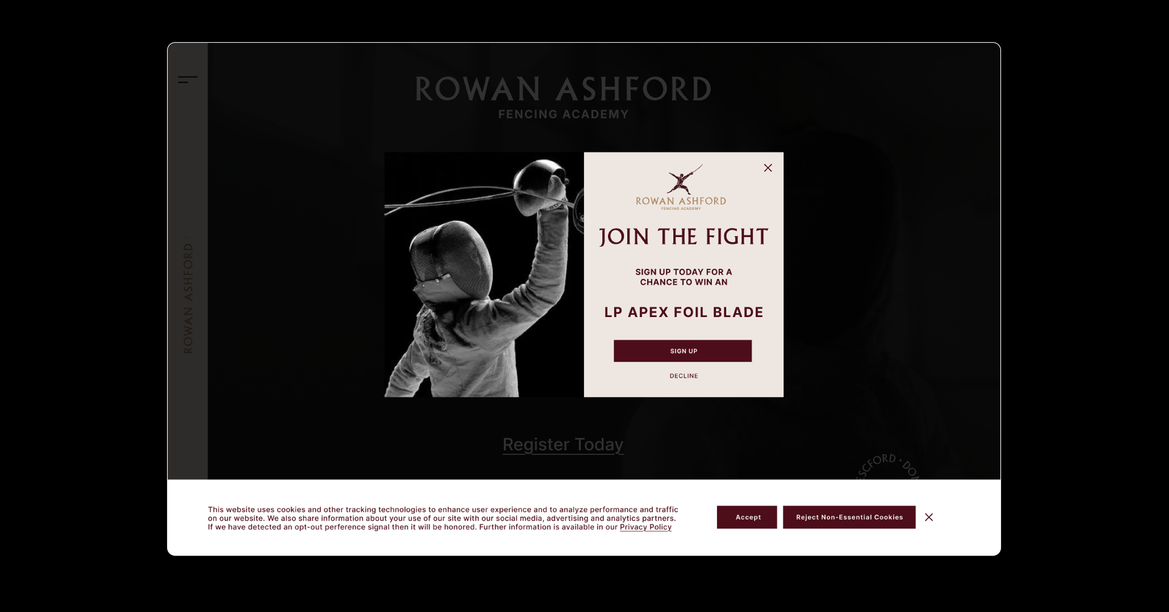
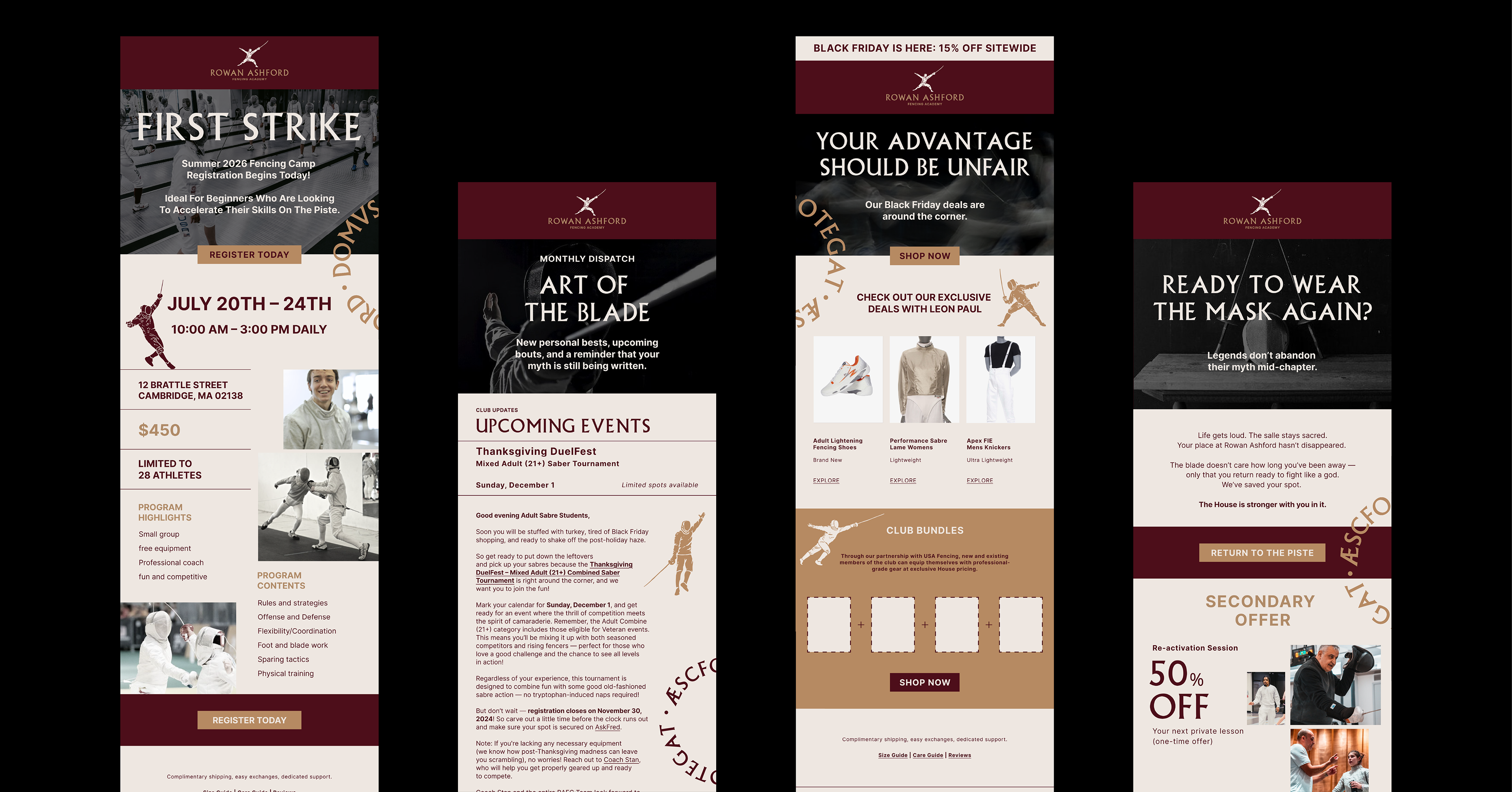
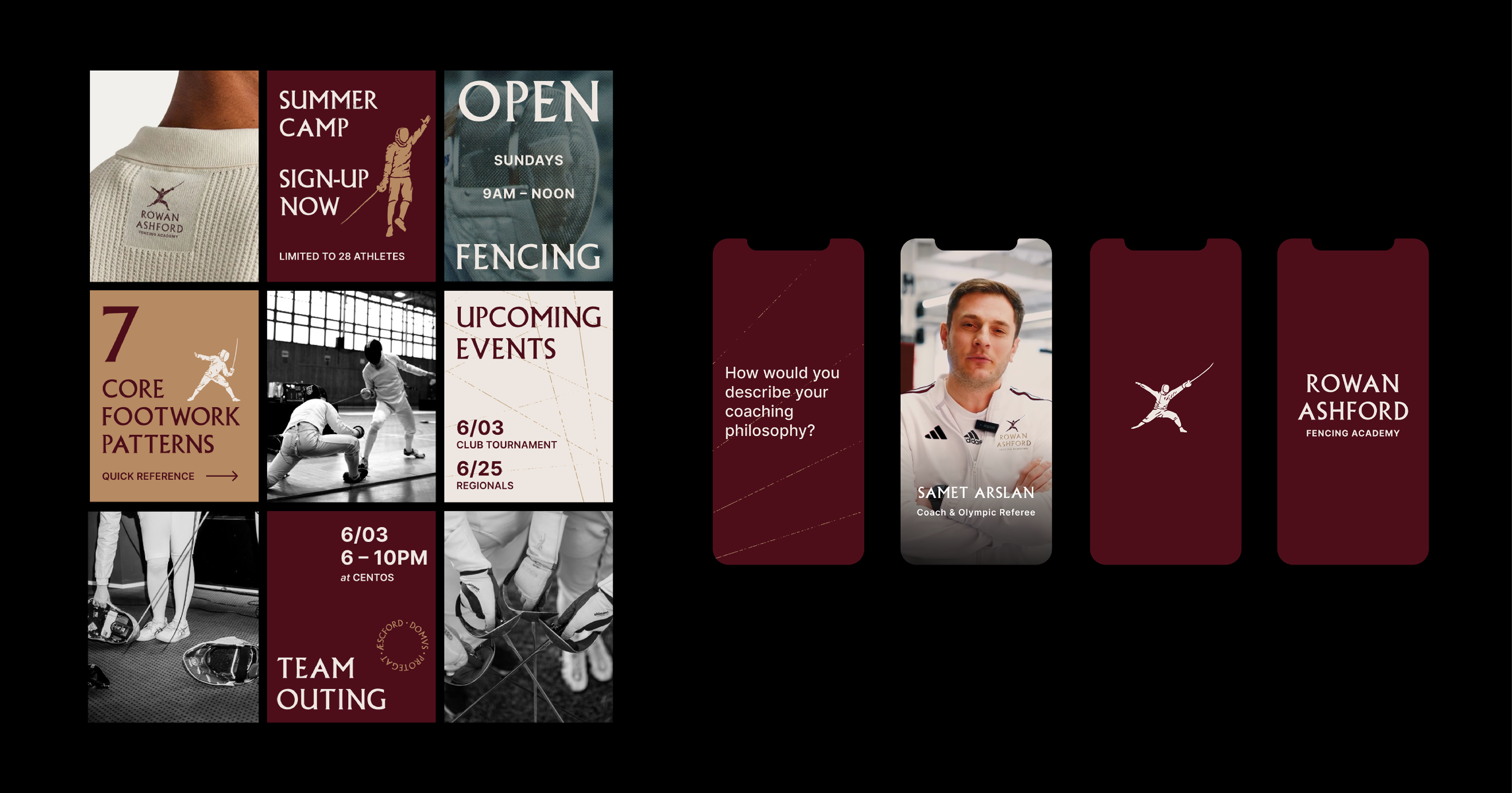
COLLATERAL
The sophisticated and aspirational presence of the brand is reinforced through various user touchpoints, including digital, print, and physical collateral.
The sophisticated and aspirational presence of the brand is reinforced through various user touchpoints, including digital, print, and physical collateral.
Disclaimer: I do not hold nor own any rights to the photos and video used in this project. All images and video are not my own and belong to their respective copyright owners.